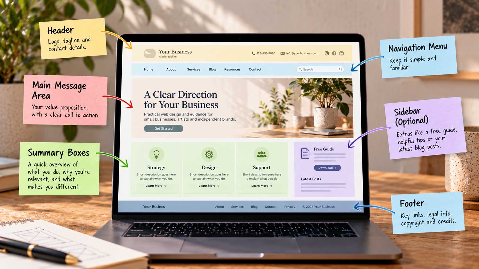
It helps to picture a homepage as a set of zones, each with its own job. Designers often sketch this as a simple wireframe before thinking about colors or photos. Here’s a classic layout, from top to bottom, and what each zone should do.
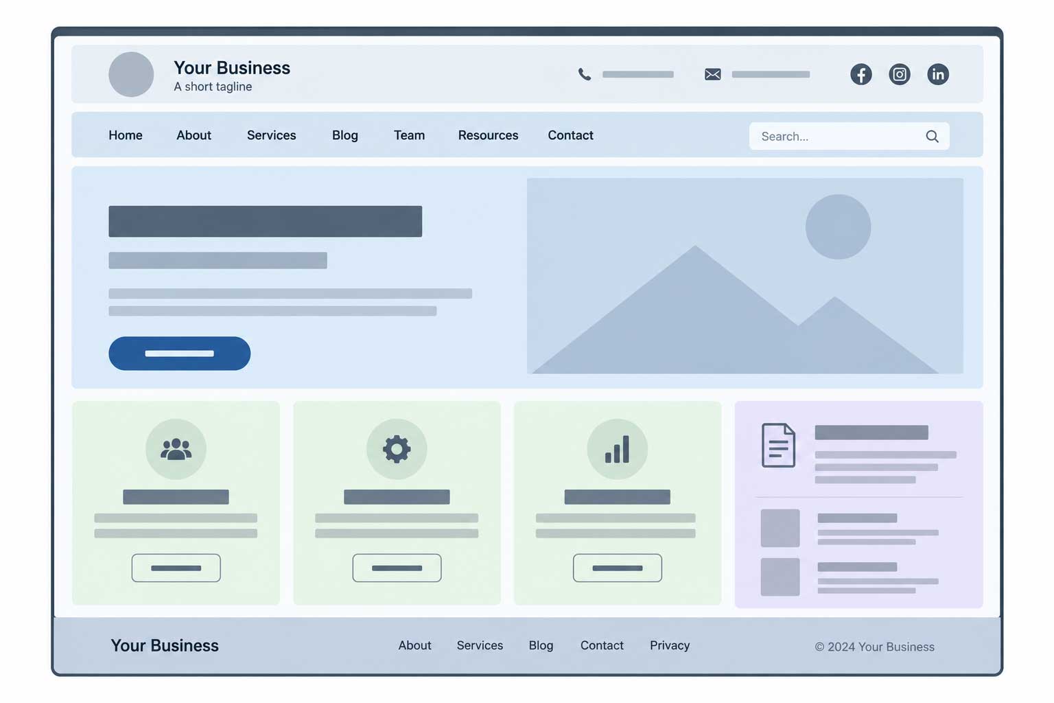
The header. At the top left sits your logo, with a short tagline if you have one. Visitors look here first to confirm they’re in the right place. On the right side of the header, place your contact details if they matter to your customers: an address, a phone number, and email or social icons.
The navigation menu. Just below or beside the logo comes the main menu. Keep the labels short and familiar: About, Services, Blog, Team, Resources, Contact. A search box nearby helps on larger sites. People shouldn’t have to think about where a link will take them.
The main message area. This is the largest zone on the page, often a strong image, a short video, or a single headline with a supporting line. It’s where you state your value proposition and place your primary call to action. If you use a slideshow here, keep it short and well-sized, a topic we’ll cover in detail later in this series.
Summary boxes. Below the main message, a row of two to four boxes can briefly explain what you do, why you’re relevant, and what makes you different. Each box gets a short heading, a sentence or two, and a “More” link to the full page.
A sidebar, if needed. Some sites add a narrow column for helpful extras, such as a free guide to download, useful tips, or your latest blog posts. Sidebars work well for content-rich sites, but they’re optional. On a phone, they’ll usually stack below the main content anyway.
The footer. At the bottom, repeat your key links and include the essentials: privacy policy, disclaimers, copyright, and credits. Visitors who scroll all the way down are often looking for these details, or for a way to contact you.
This structure isn’t the only way to build a homepage, but it’s a reliable starting point. Sketch these zones on paper before you open any design software, and you’ll find the rest of the decisions much easier.