Above the fold website design 101
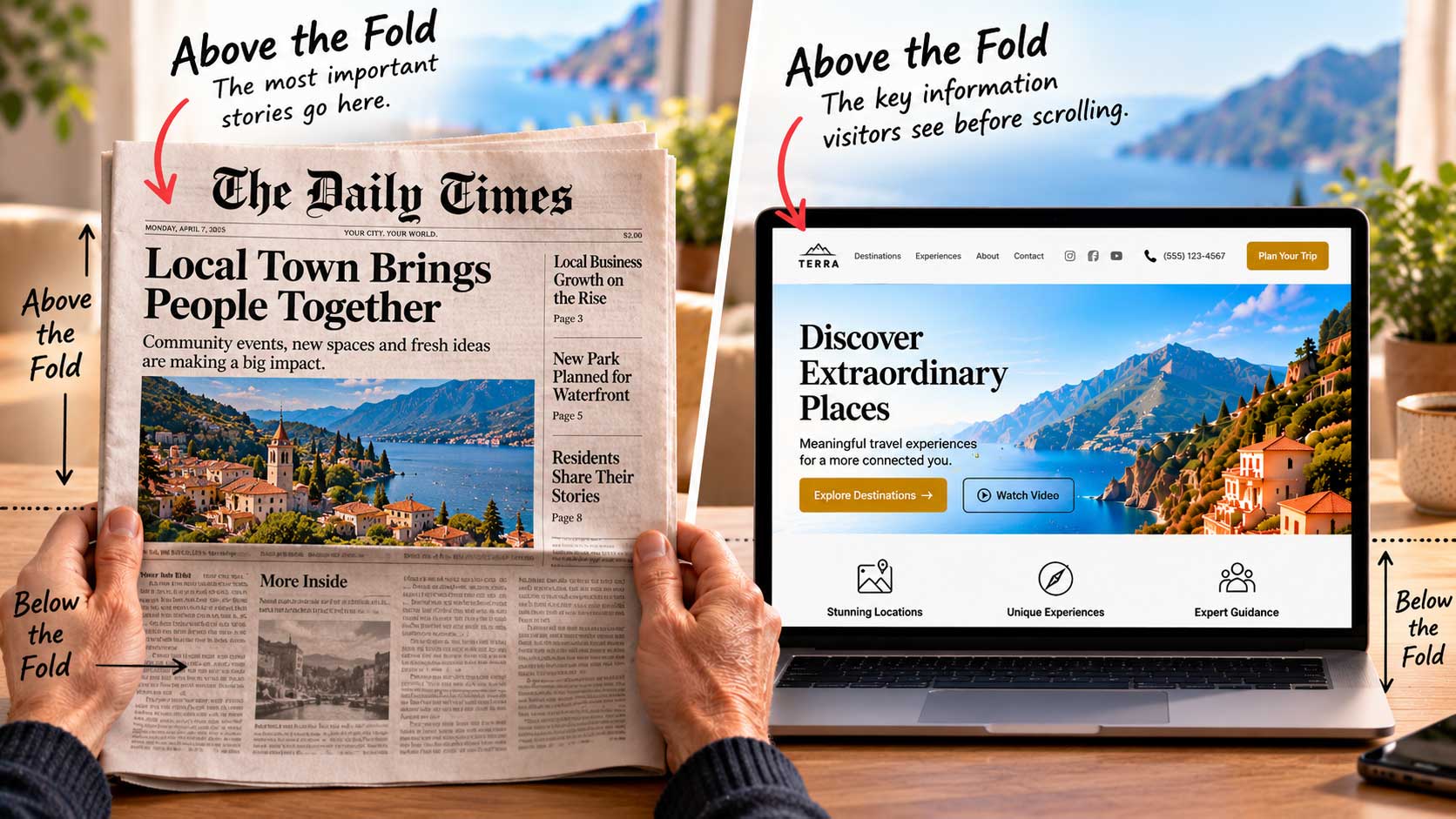
“Above the fold” is a newspaper term. It describes the top half of a folded paper, where editors placed the most important stories so the headlines could be read from a distance at a newsstand. Your homepage should follow the same logic.
On a website, the area above the fold is everything a visitor sees before scrolling. It’s your newsstand moment: the few seconds when someone decides whether to pick you up or walk on by.
The five Ws, and how. Newspaper journalists have long been taught to answer the basic questions of any story right at the start: who, what, when, where, why, and often how. Visitors arriving on your homepage expect the same thing. Before anything else, they want to know who you are and whether you can help them.
So what should go above the fold? Here’s a practical list:
- Your company name and logo.
- A clear statement of who you are.
- Your value proposition: what you offer, summed up in a short, compelling line.
- Why this is relevant to the person who just arrived.
- How visitors will benefit. A well-chosen image can often say this faster than words.
- How to reach you: phone number, address, or email, where appropriate.
- A well-organized navigation menu, with links to your social pages.
- Clearly placed call-to-action buttons that lead visitors to the most important content on the rest of your site.
Phone number or not? If your business runs on contact forms and email, it’s perfectly fine to leave out a phone number. But if your business is built on customer service, put that number in the header, in clear view.
A list, not a mandate. Just because this list is long doesn’t mean you need to squeeze every item onto your homepage. Far from it. Think of it as a menu of options, then choose only what your visitors truly need in those first seconds. The next post explains why less is usually more.