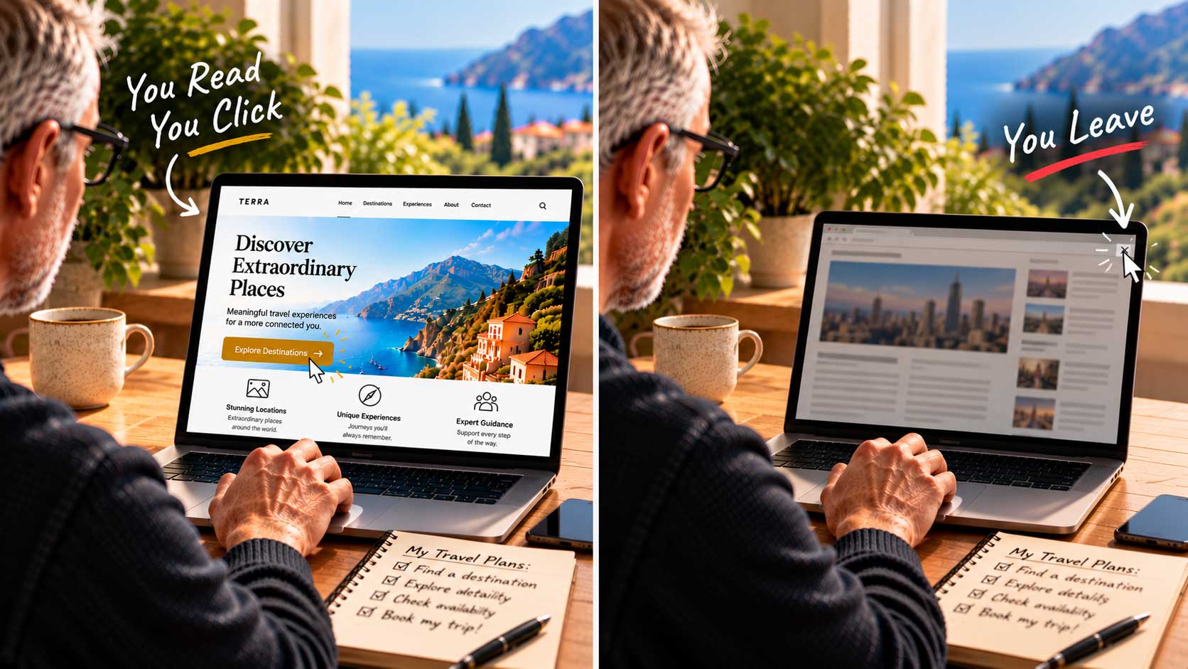
When you land on a website, you pause for a moment to take it all in. Then, within the next few seconds, one of three things happens: you read, you click, or you leave.
You look and read. What catches your eye first? How relevant is the headline to what you searched for? Does the page meet your expectations? Is there enough information in those first few seconds to make you want to stay?
You click. If the offer is a good fit, your reaction can be instant. You click, and you may even gladly hand over your contact details to find out more.
You leave. It only takes a split second to decide whether a page is for you. If you leave without reading or clicking, you’ve judged in a few brief seconds that this website isn’t what you need. With countless other search results waiting, why spend time on a page that doesn’t get to the point? Leaving a site as quickly as you arrived has a name: a bounce.
Your homepage has to communicate its message within those first few seconds, using compelling images and clear call-to-action text. If the information isn’t right, visitors bounce, and there are rarely second chances.
Art, science, and psychology. Good web design has always been called both an art and a science. Today it leans more toward science than ever, as technology lets us map user behavior and even eye movement in real time. How people react psychologically to your content and design can decide whether they stay or go.
Compare the websites of well-known brands and you’ll find one common thread: the key information you came for is never more than a click away. That’s not an accident. It’s the result of careful decisions about what goes where, and why.
In the posts that follow, we’ll look at the techniques you can apply to any homepage, regardless of your business. If you’re new to web design, there are a few fundamental rules that belong on every homepage, and we’ll start with the most important one: what visitors see before they scroll.