In the last post, we covered why color matters. Now for the practical part: how to choose a palette that works, even if color isn’t your strong point.
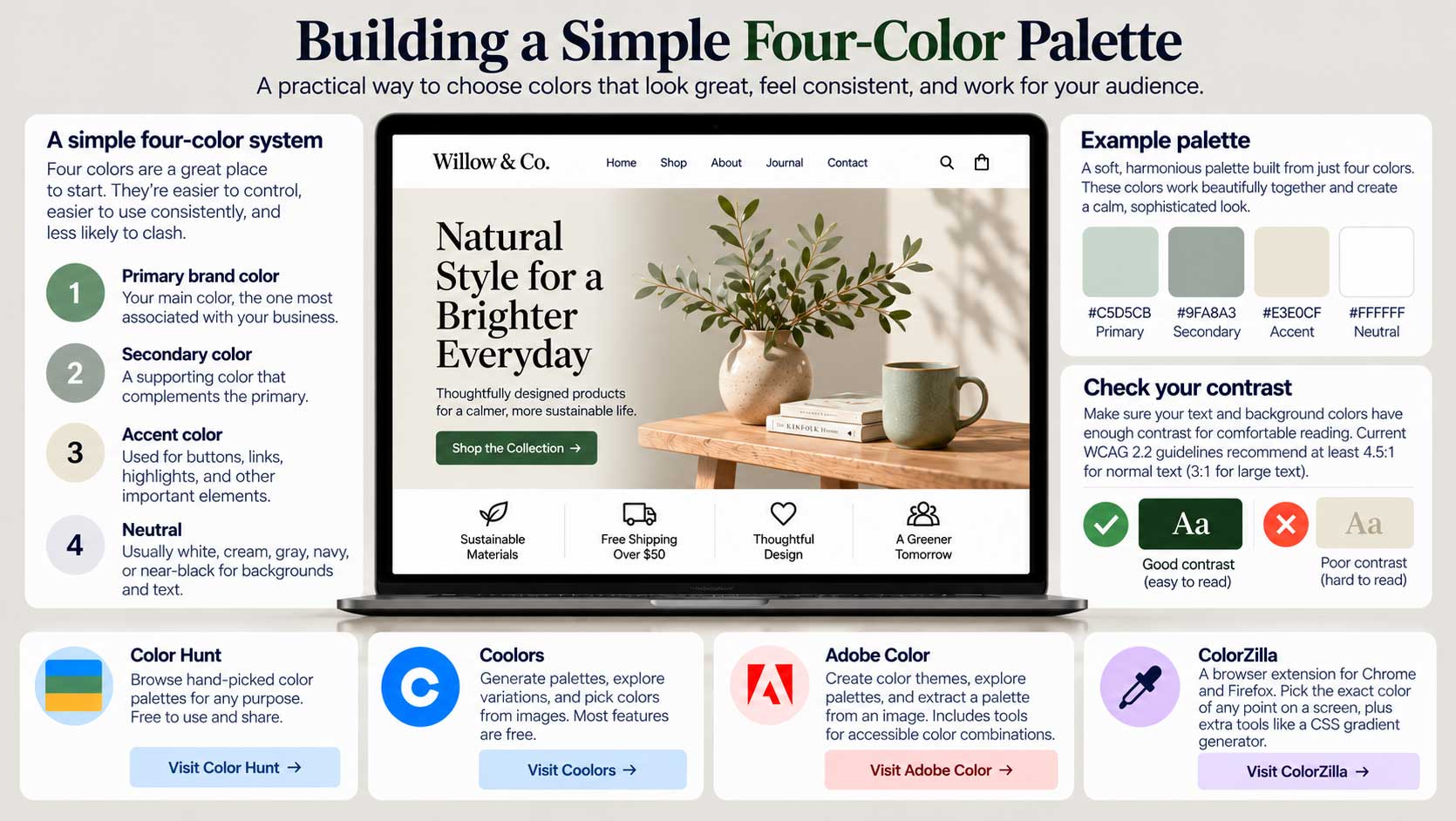
Start with four colors. There’s no rule saying a website can only use four colors, but four is an excellent place to start. A limited palette is easier to control, easier to use consistently, and less likely to turn into a collection of colors competing for attention.
Think of it as a simple system rather than a restriction. You might choose:
1. A primary brand color — the color most associated with your business.
2. A secondary color — something that complements the primary color.
3. An accent color — used sparingly for buttons, links, highlights, or other things you want people to notice.
4. A neutral — usually white, cream, gray, navy, or near-black for backgrounds and text.
You can create lighter and darker variations of those colors when necessary without suddenly introducing a completely unrelated palette.
Harmony matters more than quantity. Here’s an example I’ve always liked: a soft pastel scheme built from pale sage green (#c5d5cb), muted gray-green (#9fa8a3), warm cream (#e3e0cf), and white.
Paired with photography in similar tones, the result can feel subtle and sophisticated.
Notice how the colors relate. They share a similar softness, and none of them shouts for attention. That’s what you’re looking for: colors that feel as though they belong together.
But there’s another test your palette needs to pass: can people actually read it?
A beautiful palette isn’t necessarily an accessible one. Before committing to colors for text, buttons, or other important interface elements, check their contrast. Current W3C guidance for WCAG 2.2 uses a minimum contrast ratio of 4.5:1 for normal text, with 3:1 permitted for sufficiently large text; important non-text interface elements generally need at least 3:1 against adjacent colors. W3C
Fortunately, you don’t have to calculate any of this yourself. Contrast-checking tools do it for you.
Free tools for building a palette.
Color Hunt is a wonderfully simple place to browse hand-picked palettes. You can search by moods and categories such as pastel, vintage, warm, cold, nature, cream, dark, and many others. Color Hunt
Coolors lets you generate palettes, keep colors you like, explore alternatives, pick colors from images, and work with other color tools. Most of its core features can still be used free, although some features are part of its Pro offering. Coolors
Adobe Color is another excellent option. You can create color themes, explore palettes made by other designers, and extract a palette from an image. That’s particularly useful if you already have a photograph, logo, product, or piece of artwork that captures the feeling you want for your website. Adobe
Find the exact color of almost anything. Ever seen a color on a website and wished you knew exactly what it was?
ColorZilla is a browser extension for Chrome and Firefox that includes an eyedropper, color picker, page color analyzer, and CSS gradient generator. You can sample a color from a webpage, get its exact value, and copy it into your website builder or design software. ColorZilla
Do you need to learn color codes? Not really. Modern website builders give you visual color controls, and once you’ve chosen your palette you can simply save the HEX values — something like #C5D5CB — and reuse them consistently.
But understanding what those codes represent is useful. It makes it easier to move your colors between your website, graphics software, email templates, and other digital tools.
The important part isn’t knowing the code. It’s having a system.
Start with a small palette. Give each color a job. Check that your important combinations have enough contrast. Then use those colors consistently throughout the site.
Four well-chosen colors used with discipline will usually produce a more professional result than twelve colors chosen because you happen to like them.
And once you have your palette, there’s another question:
How much of each color should you actually use?
That brings us neatly to the next part of the Guidebook.