Principles are easier to understand when you see them in action. Here are three homepages I’ve reviewed over the years, described without names, and what each one teaches.
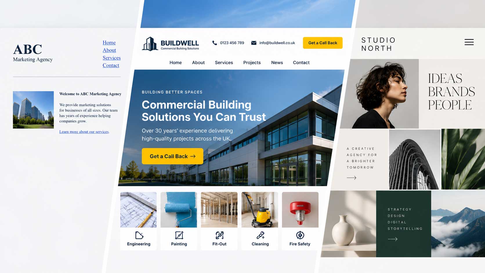
The underwhelming homepage. The first was a marketing agency’s site, built in simple HTML. Technically, its company information sat above the fold. But the design was dated, the text was tiny, and there was almost nothing to read. I couldn’t tell what made them different, what they had achieved, or even how to call them. The lesson: putting information above the fold isn’t enough. It has to be the right information, presented with enough care to earn trust.
The homepage that got it right. The second belonged to a company offering services to the commercial building industry. Its redesign showed exactly what most people expect when they land on a homepage. The logo, phone number, and email were in the header. A clear headline stated who they were and what they did, with a short line about their 30 years of experience. Below that, a row of image tiles showed each service: engineering, painting, fit-out, cleaning, and fire safety. A bright “Get a Call Back” button sat in the top right. Everything was neatly arranged above the fold, and the next step was obvious. Sites like this take customization and care, but the results are worth it.
The beautiful puzzle. The third was a creative agency’s homepage laid out like a grid of calendar squares. It looked stylish, with fashion photography scattered across the tiles. But there was no obvious navigation menu, no phone number, and no clear starting point. The body text was set at 12 pixels, far too small to read comfortably. Visitors’ eyes wandered around the grid with no instructions on what to do next.
That last example breaks a basic rule of how people read. Eye-tracking research shows that readers scan web pages in a fairly predictable pattern, starting at the top left. Forcing people to bounce around a page looking for information usually leads them to bounce off your website entirely. We’ll explore that research in detail later in this series.
The common thread? Good homepages respect the visitor’s time. They answer the obvious questions first and make the next step easy.