
THE
Website Design Guidebook
Clearer Websites. Better Results.
Practical web design guidance for small businesses — built around clarity, usability, and what actually works.Prefer the complete illustrated edition? Available on Kindle for $4.99.
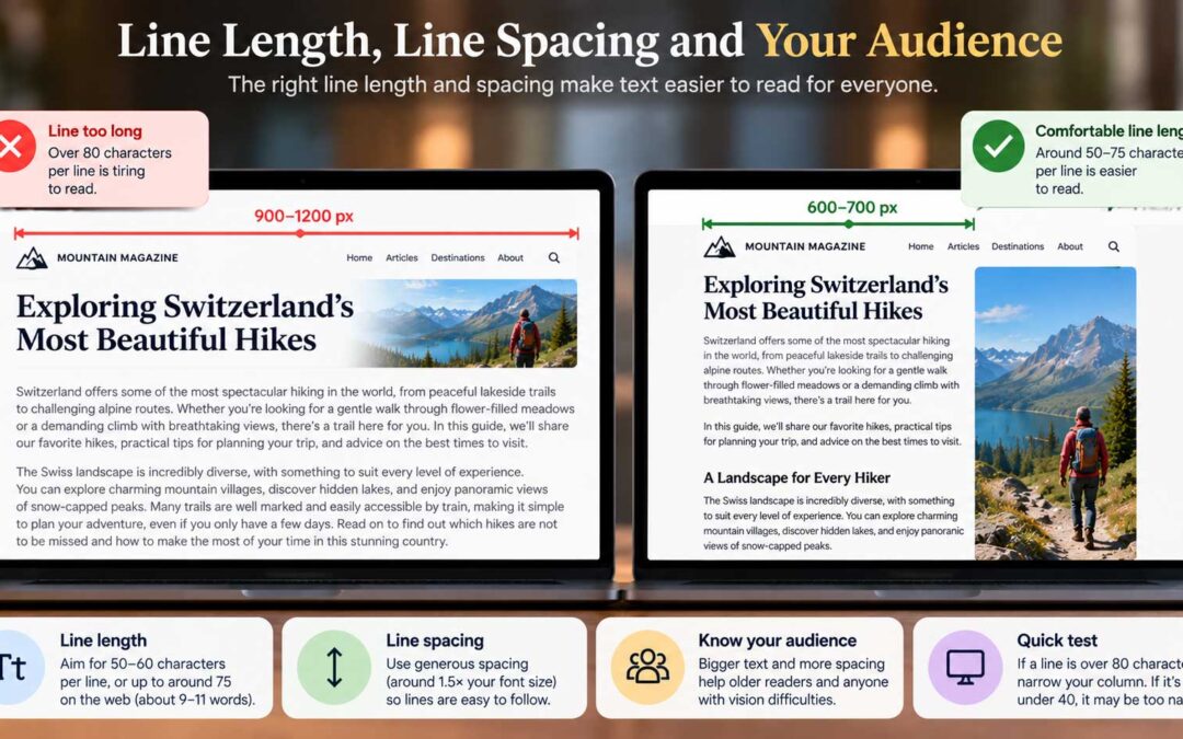
Line Length, Line Spacing and Your Audience
Font size gets most of the attention, but line length matters just as much. Lines that stretch across a wide screen are tiring to read. Your eyes have to travel too far, and when they jump back to the left, it's easy to lose your place. The ideal line length....
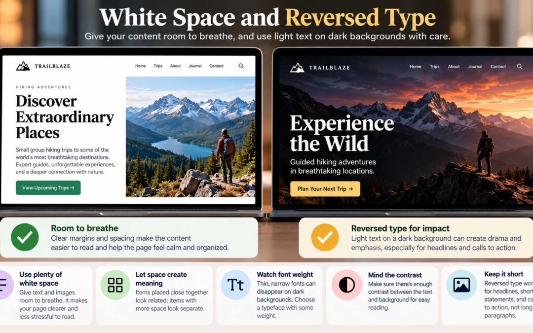
White Space and Reversed Type
Two more typography topics round out our look at readability: the space around your content, and what happens when you put light text on a dark background. Let your content breathe. How much margin and space should surround your text and images? That depends on many...
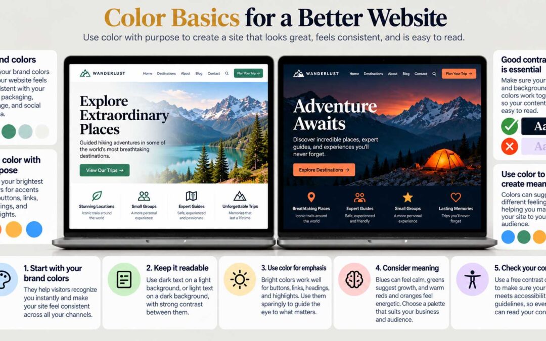
Color Basics for a Better Website
To create great web pages, a basic grasp of color theory is essential. As a painter, I've spent years mixing colors on a palette, and I can tell you that the same principles apply on screen. A designer who understands color has a major advantage. Start with your brand...
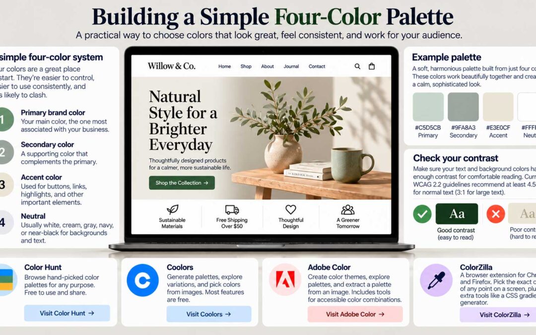
Building a Simple Four-Color Palette
In the last post, we covered why color matters. Now for the practical part: how to choose a palette that works, even if color isn't your strong point. Start with four colors. There's no rule saying a website can only use four colors, but four is an excellent place to...

Learn From Your Market Before You Design
We've now covered the building blocks: what goes above the fold, how people read, and how to size text and choose colors. The next question is how to apply them to your homepage. And that depends on what kind of website you're building. Every category has its own...
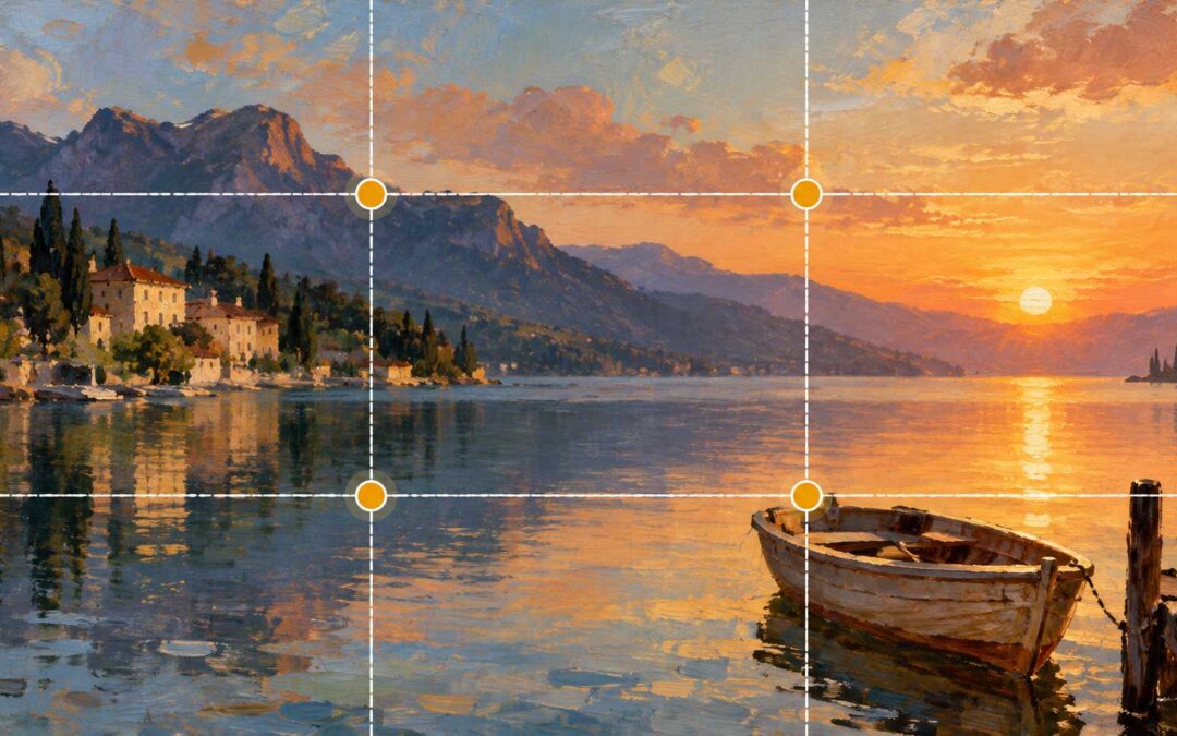
The Artist Rule of Thirds
As a painter, some of the most useful web design lessons I know didn't come from the web at all. They came from the art studio. One of the first and most basic rules art students learn is the rule of thirds, and it works beautifully on websites. What is the rule of...
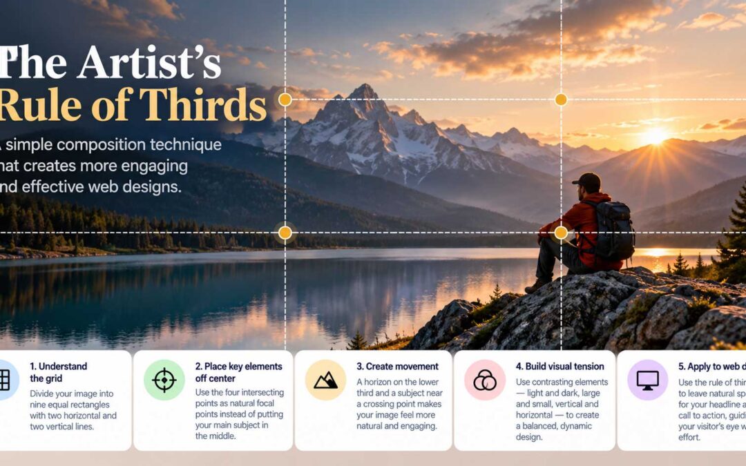
Applying the Rule of Thirds to a Homepage
In the last post, we explored the artist's rule of thirds. Now let's put it to work on an actual homepage. Start with the right image. I once designed a homepage for a website hosting service, starting with a photo of a calm lake at golden sunrise. A small wooden boat...

Minimal Web Design: Less Content, More Thought
Ultra-simple minimal web design looks easy: a photo or graphic background, a few lines of text, and a button. Yet a great deal of thought — and a few things you can't see, such as traffic — go into making it work. The familiarity principle. People tend to prefer...

E-commerce Design: Make the Product the Hero
How do you apply everything in this series to an online shop? Start by remembering that e-commerce design is still web design. It's always about the user's experience. What turns a visitor into a customer is relevance, plus a smooth flow of information covering price,...
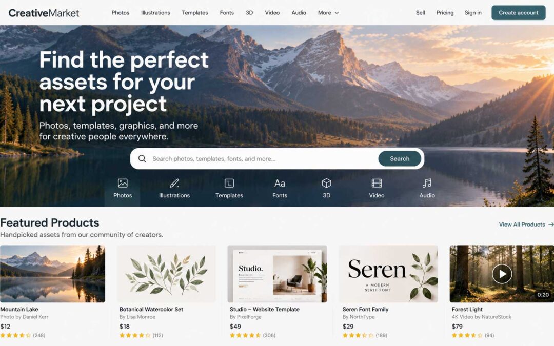
Designing a Site for Digital Products
Selling physical products online comes with plenty of challenges. Unless you already have an established business, you'll face inventory, warehousing, shipping, returns, and accounting, to name just a few. Even if you use a drop shipping supplier to handle stock and...
Clarity for your website or brand
— one session away.