To create great web pages, a basic grasp of color theory is essential. As a painter, I’ve spent years mixing colors on a palette, and I can tell you that the same principles apply on screen. A designer who understands color has a major advantage.
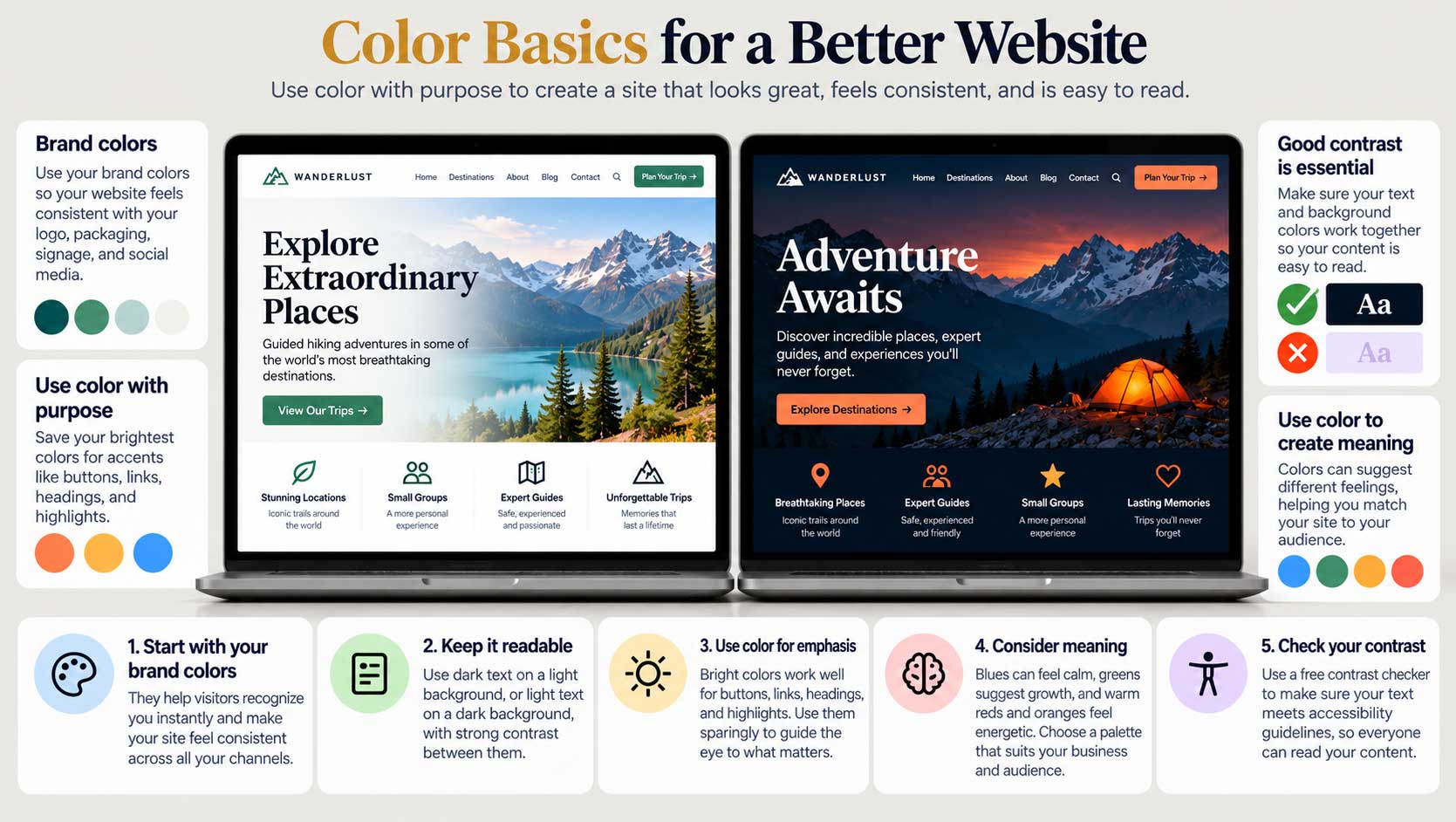
Start with your brand colors. Every good website should reflect its brand colors. They help visitors recognize you instantly and make your site feel consistent with your logo, packaging, signage, and social media. If your brand colors haven’t been established yet, you have a wonderful opportunity: you can choose a combination that’s unique to your business and design your website around it from the start.
Harmony and readability. Background colors need to work in harmony with your text colors, so they don’t clash and make your content hard to read. This is where many websites go wrong. A color combination can look striking in a logo and still be exhausting across a full page of text.
As a general rule, keep your main reading areas simple: dark text on a light background, or light text on a dark one, with strong contrast between them. Save your brightest brand colors for accents, such as buttons, links, headings, and highlights. When accent colors are used sparingly, they guide the eye to what matters.
Color and meaning. Colors also carry associations. Blues often feel calm and trustworthy, greens suggest nature and growth, warm reds and oranges feel energetic and urgent. These associations aren’t universal rules, and they vary across cultures, but they’re worth considering. A palette should feel right for your business and your audience, not just look attractive.
Check your contrast. Accessibility guidelines from the World Wide Web Consortium (W3C) set minimum contrast levels for text, so people with weaker eyesight or color blindness can read it. Free online contrast checkers let you test any pair of colors in seconds. If your text fails, darken it or lighten the background until it passes.
If color isn’t your strength. Not everyone has a natural knack for color, and that’s perfectly fine. Unless you’ve studied graphic design or have a trained eye, you’re often best off using proven color combinations rather than inventing your own. Fortunately, there are excellent free tools to help, and we’ll look at them, along with a simple rule for building a palette, in the next post.