Two more typography topics round out our look at readability: the space around your content, and what happens when you put light text on a dark background.
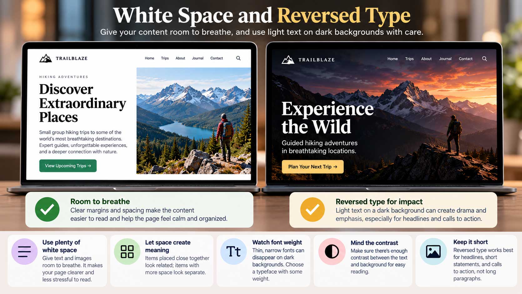
Let your content breathe. How much margin and space should surround your text and images? That depends on many factors, but the general rule is simple: images and text need room to breathe, both on their own and next to each other. When elements are crammed together, a page feels cluttered and stressful, and readers struggle to see what belongs with what.
Space also creates meaning. Items placed close together look related; items with more space between them look separate. Used well, white space quietly organizes your page without any extra lines or boxes.
The main exception is gallery-style photo layouts, where images sometimes touch or even overlap for dramatic effect. That’s a deliberate choice, not an accident of crowding.
What is reversed type? In graphic design, reversing type means using white or light-colored text on a dark background. It’s a technique that goes way back in print, and it can give your content richness and emphasis. Think of a glossy magazine spread for a luxury car at night, where a few simple white letters on black invite you to step in and take a ride.
The rules of reversing. Reversed type is powerful, but it comes with some major pitfalls. The goal is to create interest and contrast without clashing with other elements or sacrificing readability. Keep these points in mind:
- Watch the font weight. Thin, narrow fonts look even thinner against a dark background and can almost disappear. Choose a typeface with some weight.
- Mind the contrast. If the background isn’t dark enough, or the colors clash, the text becomes hard or impossible to read. Imagine a full page of white text on a pale green background.
- Beware busy images. Placing text over a photo is a form of reversing. If the image has light patches, detailed textures, or bright highlights, parts of your text will vanish. A darkened overlay or a solid band behind the text can solve this.
- Keep it short. Reversed type works best for headlines, short statements, and calls to action. Long paragraphs of light-on-dark text are tiring to read.
Use reversed type for emphasis, not as a default, and it will do exactly what you want: make the important things stand out.