How do you apply everything in this series to an online shop? Start by remembering that e-commerce design is still web design. It’s always about the user’s experience. What turns a visitor into a customer is relevance, plus a smooth flow of information covering price, value, benefits, and clear instructions on how to buy.
Give shoppers perfect information. Your job is to inform customers and help them make a confident decision. The design should support the product information and offer clear paths to checkout, creating a smooth journey from browsing to buying, like a river flowing to the sea. Showing product thumbnails in the shopping cart, for example, reassures people they’ve chosen the right item.
Navigation is essential. Shoppers want to find their product category quickly, so clearly labeled menus matter. Many shops add category menus down the left or right side, in addition to the main header navigation, along with a prominent search bar. Modern menus can also show product images and short descriptions, helping people find what they want faster.
Thumbnails and breathing room. Product images on your homepage are among its most important elements. Choose thumbnail sizes and description boxes that suit your products and layout. And give the page enough space to breathe, so shoppers don’t feel overwhelmed by images and design.
The product is the hero. There’s an old saying in advertising: the product is the hero. Make every product the hero of its own page, with high-quality photos from several angles. Lifestyle imagery is especially important. Show your products being used, worn, or enjoyed in real settings, so customers can picture them in their own lives.
Lessons from the giants. Large marketplaces like Amazon offer a useful lesson in e-commerce layout. Their homepages carry very little explanatory text. Instead, products are arranged in neat rows by category, with deals and popular items near the top. All the essential navigation, including search, account, and cart, sits in the header, so shoppers can start immediately without scrolling.
Large stores sometimes use smaller fonts in detailed product listings, because shoppers are scanning for specific information and space is precious. That’s a deliberate trade-off, not a model for your main content.
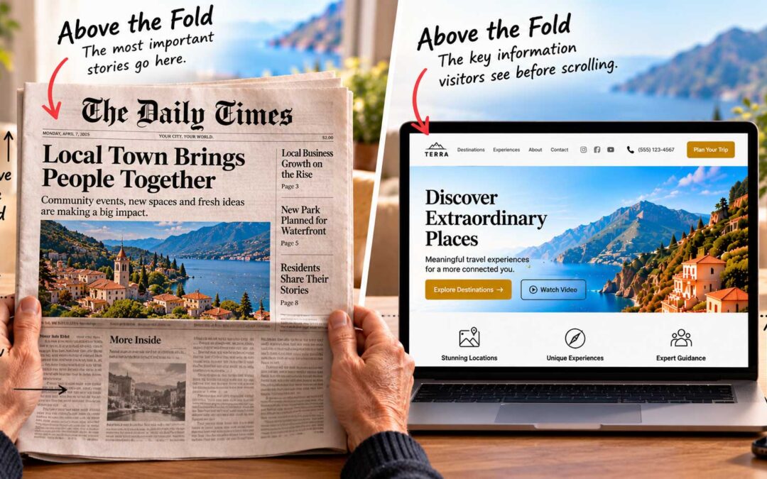
Above all, the principles from earlier in this series still apply. Put the most important information above the fold, make the next step obvious, and remove anything that stands between your customer and the checkout.