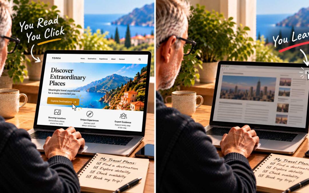
As a painter, some of the most useful web design lessons I know didn’t come from the web at all. They came from the art studio. One of the first and most basic rules art students learn is the rule of thirds, and it works beautifully on websites.
What is the rule of thirds? Imagine dividing a picture into a grid of nine equal rectangles, with two lines running across and two running down. The four points where those lines cross are natural focal points. Instead of placing your main subject dead center, you place it on or near one of those four points.
A landscape photo, for example, often looks more interesting with the horizon on the lower third line rather than straight through the middle, and with the main subject, such as a boat or a tree, near one of the crossing points. The off-center placement creates movement and draws the eye naturally through the image.
A guideline, not a law. The rule of thirds is a guide to help artists place elements and focal points. It isn’t a law. If you want viewers to ignore everything else and focus on one subject, you can break the rule and center it like a bull’s-eye. What matters is knowing why you’re making a choice and what effect it will have on the viewer. That understanding is what leads to good composition.
Compositional tension. To create a rich, captivating visual experience, artists arrange forms in space so they interact with each other. There should be a kind of harmonic rhythm in the design. Artists sometimes call this compositional tension: a sense of energy and life in a layout where all the parts relate to each other.
For that tension to work, some elements must contrast or pull against each other, so that each part can be fully appreciated. A large image balanced by a small block of text. A dark area set against a light one. A strong vertical shape beside a calm horizontal one.
A strong composition is made of visual relationships that support and reinforce each other, plus a few that deliberately break the pattern and surprise the eye.
Why this matters for web design. Good homepage design draws equally on science, art, and typographic common sense. When you apply the rule of thirds to a background image, you open up natural spaces for your headline and call to action, and visitors’ eyes are guided to them without effort. In the next post, we’ll see exactly how that works on a real homepage.