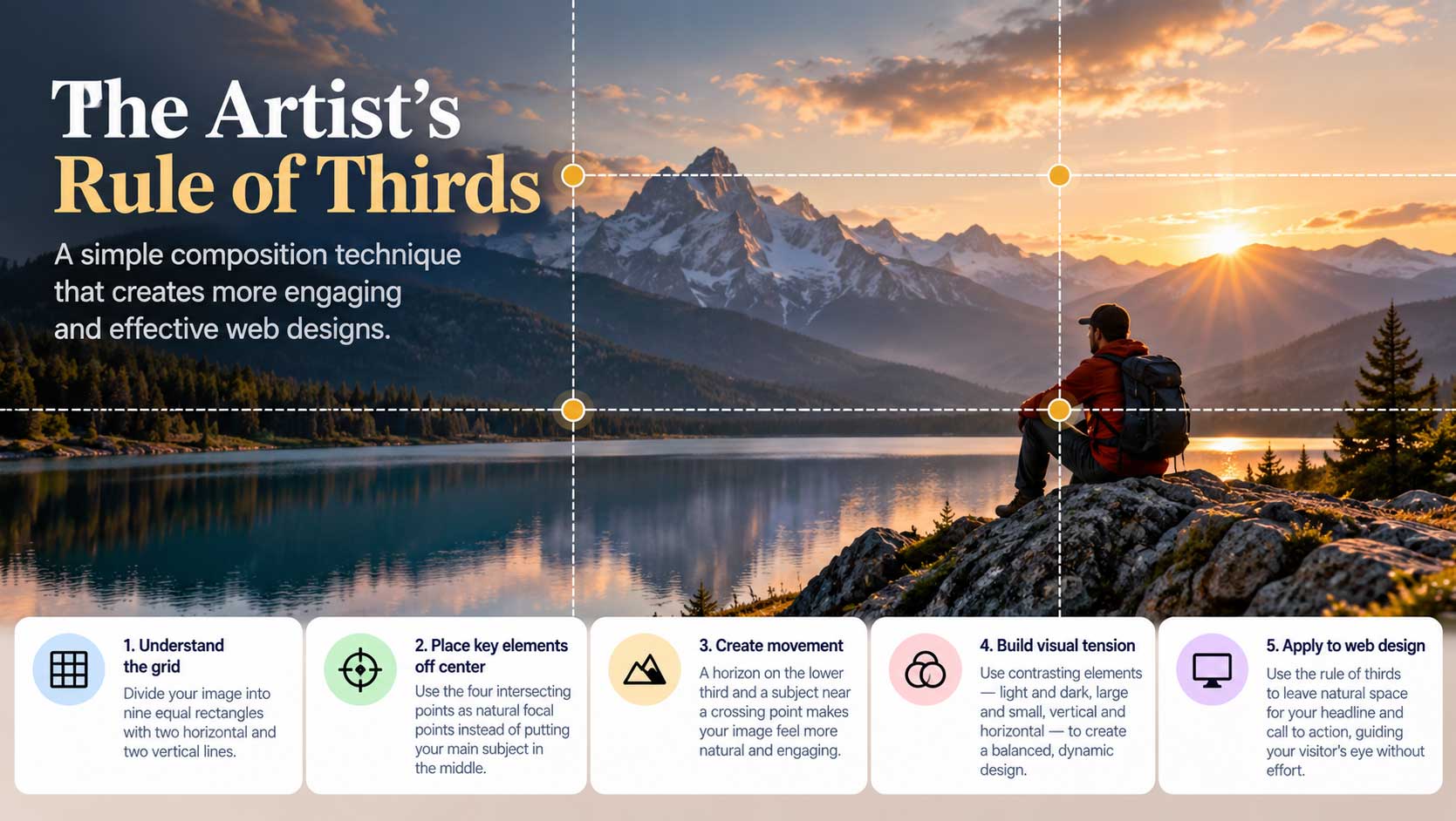
In the last post, we explored the artist’s rule of thirds. Now let’s put it to work on an actual homepage.
Start with the right image. I once designed a homepage for a website hosting service, starting with a photo of a calm lake at golden sunrise. A small wooden boat sat low and to the right of the frame, right on one of the rule-of-thirds focal points. Birds drifted across the sky, and the warm light filled the whole scene. It was a peaceful image, perfect for a service promising to take the stress out of running a website.
Because the boat, the photo’s focal point, sat in the lower right, the upper left and center of the image were left open. That open space became the canvas for the rest of the page.
Building the page, top to bottom.
- The header. The top strip had a natural spot for the logo on the left, with a clearly laid-out menu to its right. There was room in the header for social icons and a contact phone number too.
- The headline. In the open sky on the left, a clear title stated what the service offered. The background supported the message: relaxation and peace of mind.
- The supporting line. Just beneath it, a short sentence explained the benefit in plain words.
- The call to action. Finally, a simple button pointed the way. The boat in the lower right practically pointed straight at it.
The result drew you in immediately. It had a natural balance, and the eye moved comfortably from headline, to supporting text, to button, to the boat, and back again. The hidden grid did exactly what it promised.
Button or form? Instead of a button that takes visitors to another page, you could place a short contact form right on the homepage. Why make people jump to another page to do the same thing? On the other hand, if you have a specific offer on another page you want to feature, a button is the better choice.
Imagery is content. This kind of layout suits minimal web design well, because the image does much of the talking. Visitors have grown used to sites where imagery is part of the message. A calm lake says “relax.” Change it to kids in colorful sweaters playing in a schoolyard, and suddenly the page feels like it’s about children’s clothing.
Choose your image as carefully as your words, and place your message where the composition leaves room for it.