Ultra-simple minimal web design looks easy: a photo or graphic background, a few lines of text, and a button. Yet a great deal of thought — and a few things you can’t see, such as traffic — go into making it work.
The familiarity principle. People tend to prefer things simply because they’re familiar with them. Social psychologists call this the mere exposure effect. On the web, it means that using design patterns your audience already knows, or even expects, makes your site feel comfortable and trustworthy, even if they’ve never visited it before.
Many minimal sites follow a familiar formula for exactly this reason: logo top left, menu top right, a large image, a short headline, and a button.
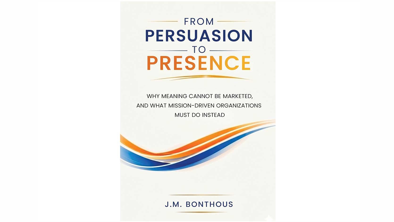
From persuasion to presence. There’s another useful way to think about familiarity and trust. In From Persuasion to Presence: Why Meaning Cannot Be Marketed, and What Mission-Driven Organizations Must Do Instead, Jean Marie Bonthous explores an approach he calls Presence Marketing — moving away from trying to manufacture meaning through persuasion and toward being present with something meaningful when people are ready to engage with it.
That idea has an interesting connection to minimal web design. A good minimal homepage doesn’t need to shout, persuade at every turn, or explain everything at once. It needs to establish who you are, communicate something meaningful, create trust, and make the visitor’s next step obvious. The simplicity works when there is real substance behind it.
You can read more about Jean Marie Bonthous’s ideas in From Persuasion to Presence.
When imagery is the content. One award-winning example I admire is a Scandinavian home furnishings brand. Its homepage opened with a large photo of a styled living room and a sofa, a two-word headline announcing a new collection, and a single button inviting you to see the catalog.
Beneath that, a short tagline captured the brand’s promise, followed by three image tiles leading to cushions, bed linen, and a featured product. For someone shopping for a sofa, those pictures really were worth a thousand words. Click any image and you were led to detailed descriptions, prices, and purchase options.
Don’t be fooled by the simplicity. That minimal homepage was the front door of a fully functioning online store.
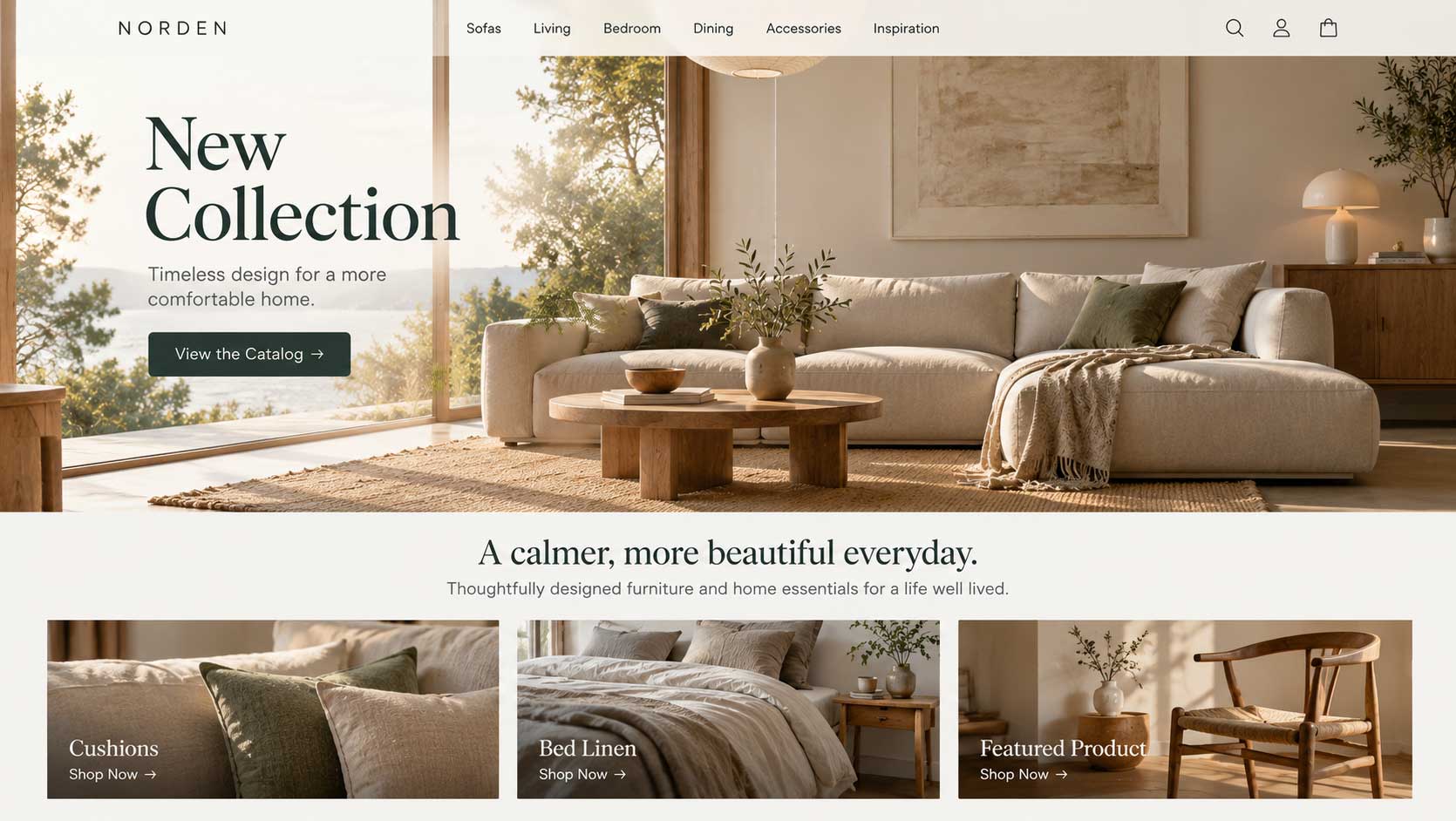
The SEO trade-off. How do search engines respond to minimal pages? There’s more to search rankings than on-page text, so a minimal homepage can still rank well if it has plenty of traffic, strong links from other sites, and a well-known brand behind it. The furniture brand’s homepage had almost no text, yet it worked because it already had an audience.
Unfortunately, many websites with beautiful minimal designs perform poorly in search. Links, mentions, and citations from other sites are hard to earn in volume, so most websites simply don’t have enough of them to make up for the missing content.
The problem is built into the design. Search engines need readable text to understand what a page is about. Without an active marketing strategy, such as email newsletters, social media, advertising, or regular blog content, you’ll eventually find yourself trading search visibility for style.
The takeaway. Minimal design is a powerful choice when you already have traffic or a strong brand, or when your imagery truly tells the story. If you’re relying on search to bring visitors, make sure the rest of your site carries real, useful content.
Minimal doesn’t mean empty. It means everything that’s there has a reason to be there.