
THE
Website Design Guidebook
Clearer Websites. Better Results.
Practical web design guidance for small businesses — built around clarity, usability, and what actually works.
Prefer the complete illustrated edition? Available on Kindle for $4.99.

What Effective Web Design Looks Like
Effective web design isn't one look or one style. It depends on the goals and content of each website. But the sites that work well tend to share a handful of clear principles, and once you know them, you start to see them everywhere. This series breaks down those...
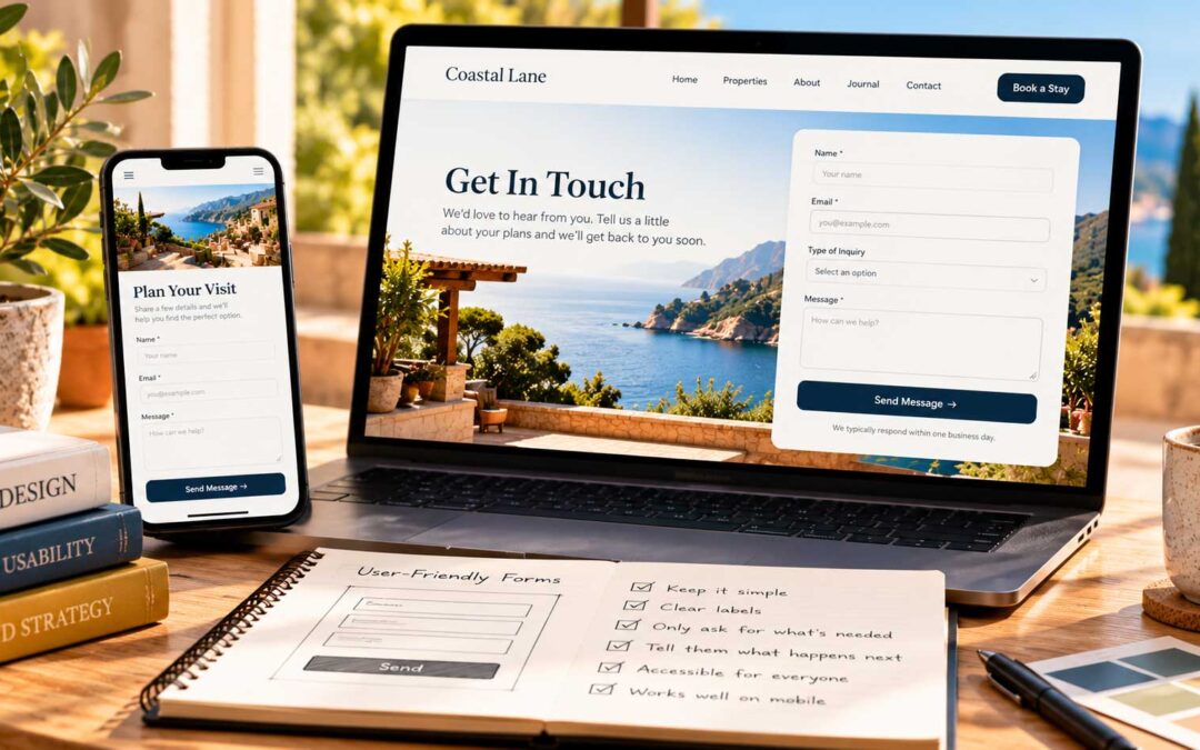
What Effective Web Design Looks Like: Part 2
In the last post we looked at navigation, responsiveness, whitespace, hierarchy, color, and consistency. Here are six more qualities that separate websites that work from websites that simply exist. User-friendly forms. Every extra field is a reason for someone to...

How The Web Design Grew Up
The first website appeared on August 6, 1991. Since then, web designers have been on a constant quest for excellence. But it didn't start out pretty. The earliest websites were written by hand in HTML, and making them look good was no easy task. In the early 1990s,...
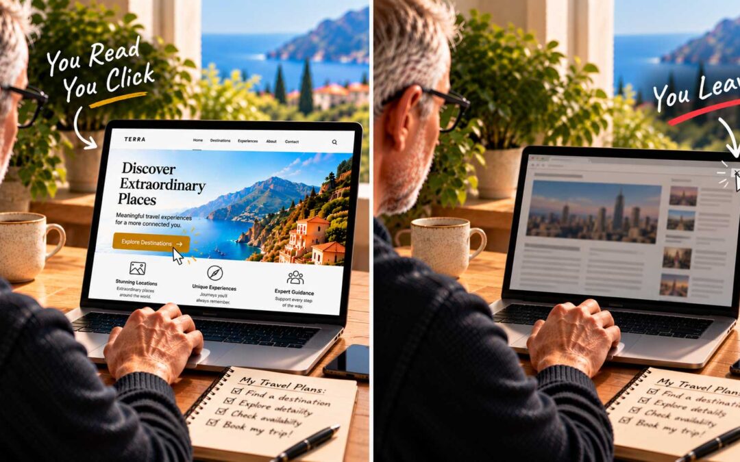
You Read, You Click, or You Leave
When you land on a website, you pause for a moment to take it all in. Then, within the next few seconds, one of three things happens: you read, you click, or you leave. You look and read. What catches your eye first? How relevant is the headline to what you searched...
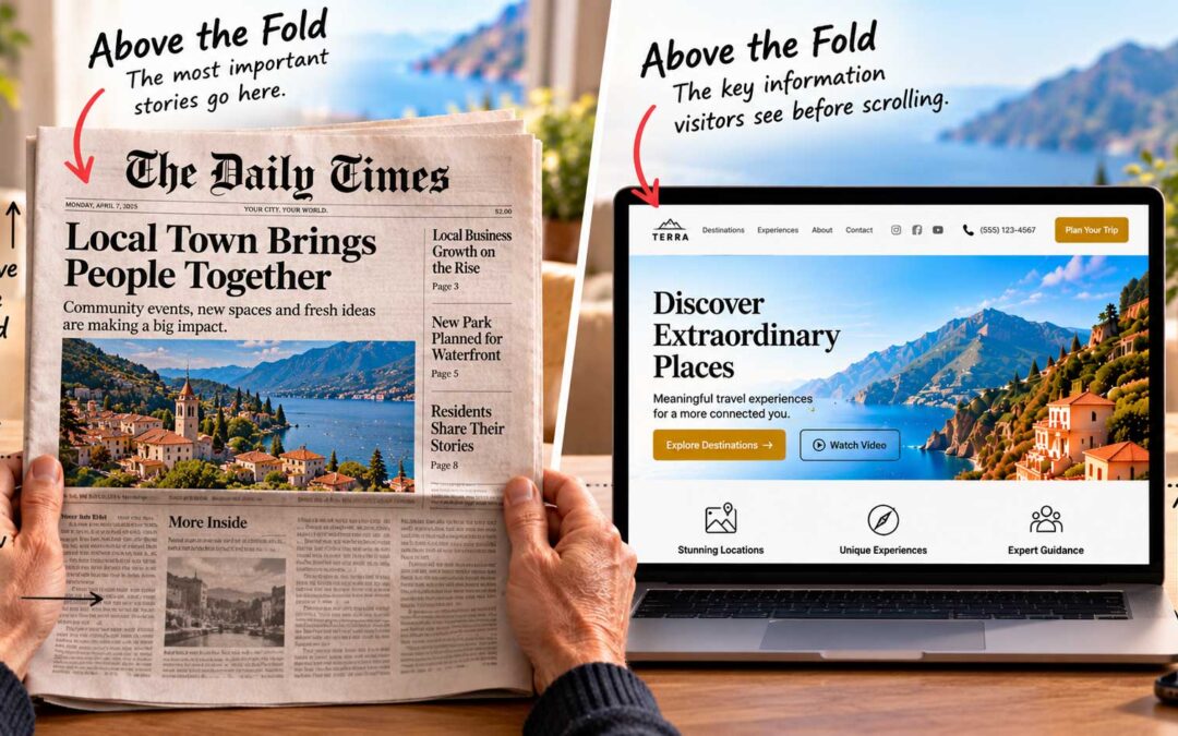
What Belongs Above The Fold
Above the fold website design 101 "Above the fold" is a newspaper term. It describes the top half of a folded paper, where editors placed the most important stories so the headlines could be read from a distance at a newsstand. Your homepage should follow the same...

Less Is More Above the Fold
In the last post, we listed everything that could go above the fold. Now for the harder part: choosing what to leave out. The top of your homepage should be as neat and minimal as possible. Give visitors brief, essential information and a call to action right away....

The Fold On Every Screen
On a newspaper, the fold is always in the same place. On the web, it moves. Where your fold falls depends on the device, the screen size, and even the browser's toolbars. That's why responsive design matters so much. A short history of small screens. The first phones...
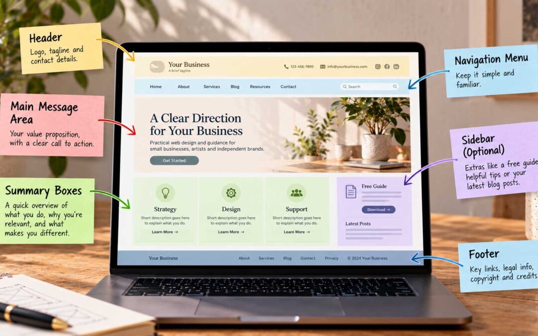
Anatomy of a Well-Planned Homepage
It helps to picture a homepage as a set of zones, each with its own job. Designers often sketch this as a simple wireframe before thinking about colors or photos. Here's a classic layout, from top to bottom, and what each zone should do.The header. At the top left...

What Good and Poor Homepages Teach Us
Principles are easier to understand when you see them in action. Here are three homepages I've reviewed over the years, described without names, and what each one teaches. The underwhelming homepage. The first was a marketing agency's site, built in simple HTML....
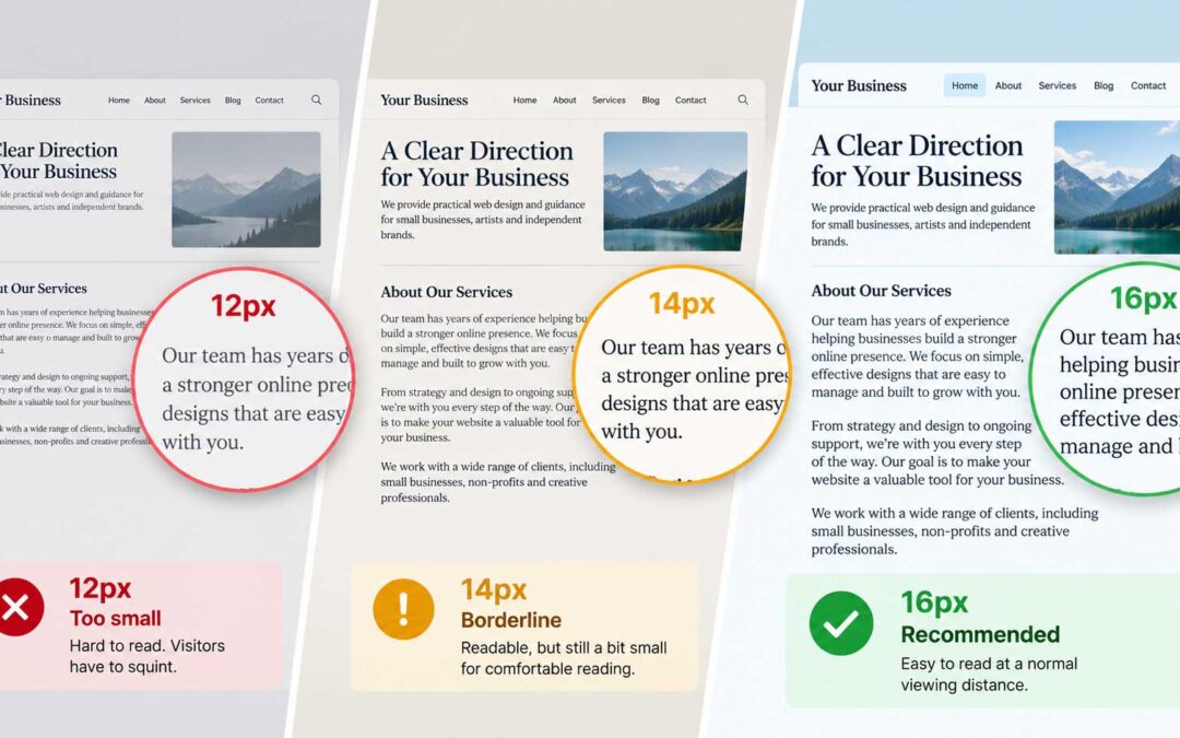
Why 16px Is the Minimum for Body Text
One of the most common problems I see when reviewing websites is text that's simply too small. Designers love the delicate look of tiny type, but visitors don't. If people have to squint, they leave. The 16-pixel rule. With few exceptions, most typographers agree that...
Clarity for your website or brand
— one session away.