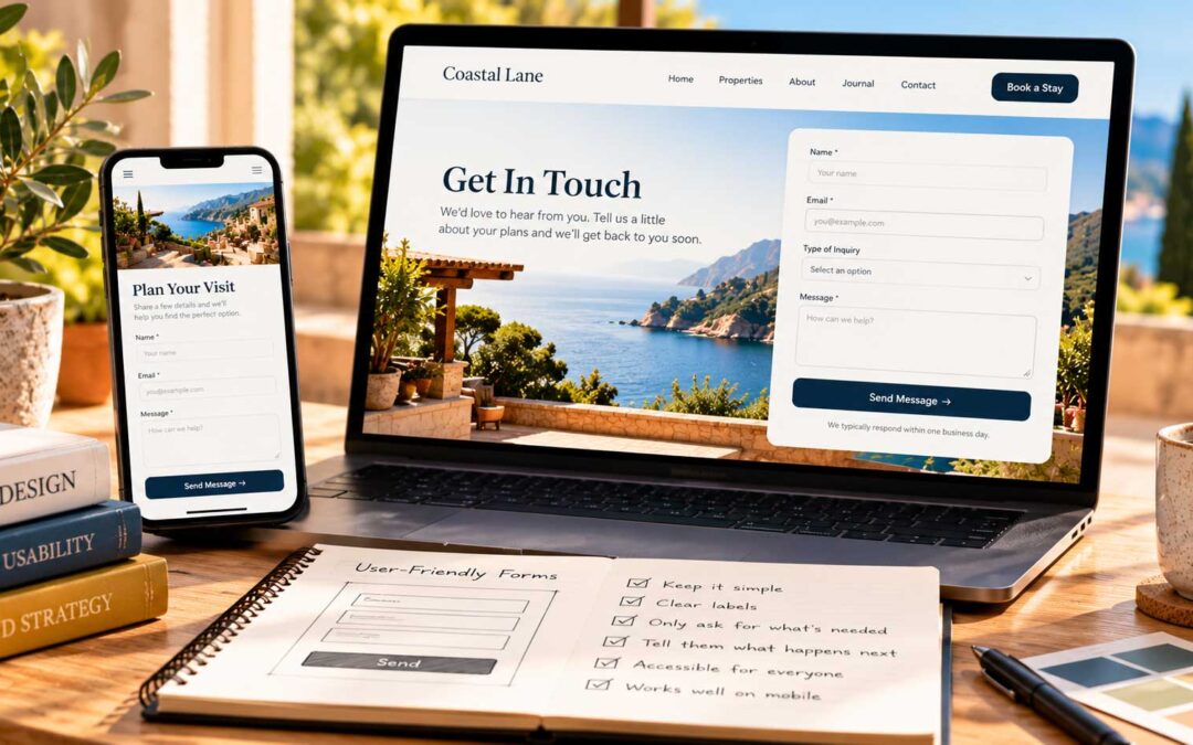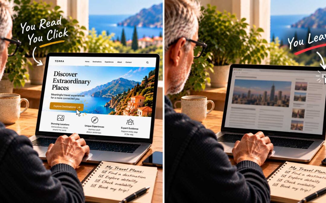

On a newspaper, the fold is always in the same place. On the web, it moves. Where your fold falls depends on the device, the screen size, and even the browser’s toolbars. That’s why responsive design matters so much.
A short history of small screens. The first phones capable of displaying web pages appeared in the late 1990s, but browsing on them was clumsy. Everything changed in June 2007, when the first iPhone launched with a 3.5-inch screen. Tablets soon followed, and suddenly people were reading websites on screens of every shape and size.
In 2010, web designer Ethan Marcotte coined the term “responsive web design” to describe sites that adapt fluidly to any screen. Using flexible layouts and CSS media queries, a single responsive website rearranges itself for a desktop monitor, a tablet, or a phone. That idea sparked what many called the responsive revolution.
Google raised the stakes. In 2015, Google began factoring mobile-friendliness into search rankings. Today it goes further: Google primarily looks at the mobile version of your site when deciding how to rank it. For most websites, more visitors now arrive on a phone than on a computer. If your site doesn’t work well on mobile, it can and will hurt both your rankings and your sales.
What this means for the fold. The fold is still relevant, but you now have several folds to design for. On a phone, the space above the fold is narrow and short, so your most important message has to be even more concise. A headline that fits neatly on one line on a desktop might wrap into four lines on a phone and push your call to action out of sight.
When you design, check your homepage on a real phone, not just a shrunken browser window. Ask the same questions you would on a desktop: Can I tell who this is and what they offer? Can I see what to do next?
Speed counts too. Even a fully responsive site will struggle if it’s slow. Google measures how quickly pages load and respond, and visitors on mobile connections are especially impatient. Compress your images, limit heavy scripts and plugins, and test your site’s speed regularly. A beautiful page nobody waits for isn’t doing its job.