In the last post, we listed everything that could go above the fold. Now for the harder part: choosing what to leave out.
The top of your homepage should be as neat and minimal as possible. Give visitors brief, essential information and a call to action right away. Everything else can wait a scroll or a click.
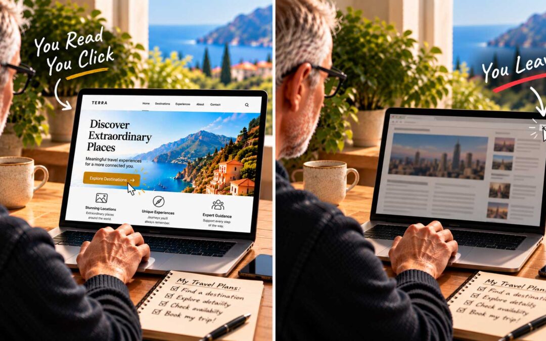
The five-second rule. A principle often quoted in web design says that visitors judge a site within its first five seconds. Usability expert Jakob Nielsen has also reported that people spend the large majority of their viewing time on the part of the page they see before scrolling. Whatever the exact numbers, the lesson is clear: the top of the page carries most of the weight.
Five seconds isn’t long. In that time, a visitor can take in a headline, a short supporting line, an image, and maybe a button. They can’t read three paragraphs, compare five offers, and scan a list of awards. When you try to say everything at once, you end up saying nothing clearly.
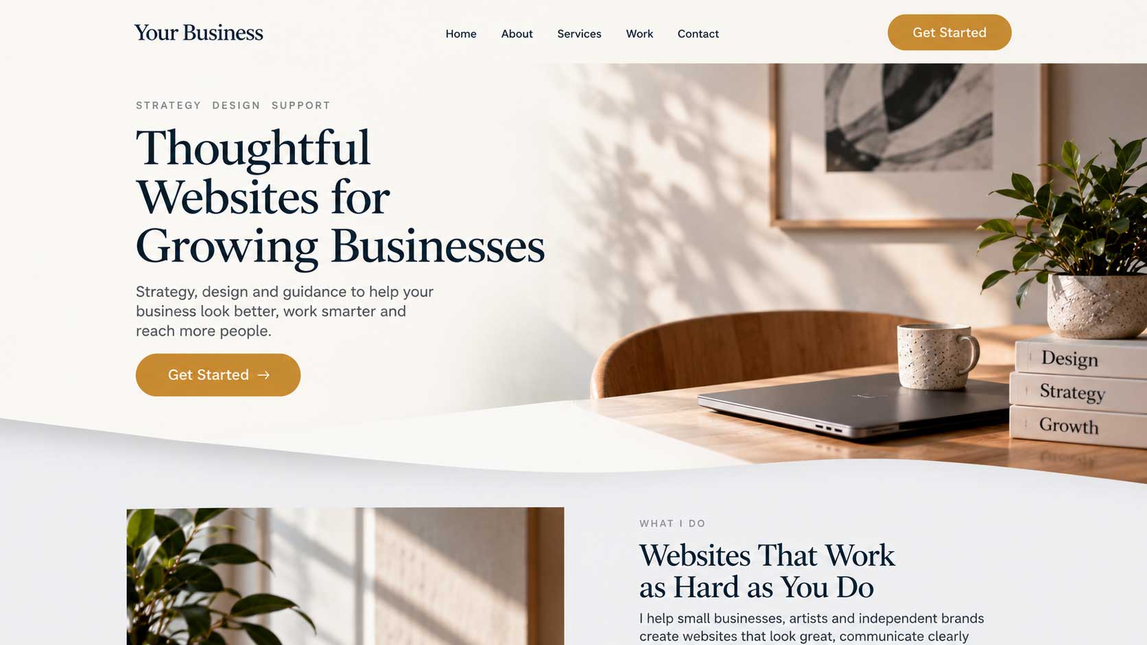
Make scrolling obvious. If your page is longer, the design needs to invite people further down. A section that’s visibly cut off at the bottom of the screen, a subtle arrow, or content that clearly continues all signal that there’s more to discover. A design that looks finished at the fold can trick people into thinking they’ve seen everything.
Too little is also a problem. Minimal doesn’t mean empty. A homepage can have its company information above the fold and still fail if the design is underwhelming and the information is too thin. If visitors can’t quickly tell what you do and how to reach you, the space is wasted, no matter how clean it looks.
A simple test. Show your homepage to someone unfamiliar with your business for five seconds, then close it. Ask them what you offer and what they’d do next. If they can’t answer both questions, simplify until they can.
The goal isn’t the fewest elements possible. It’s the right elements, arranged so the most important message lands first.