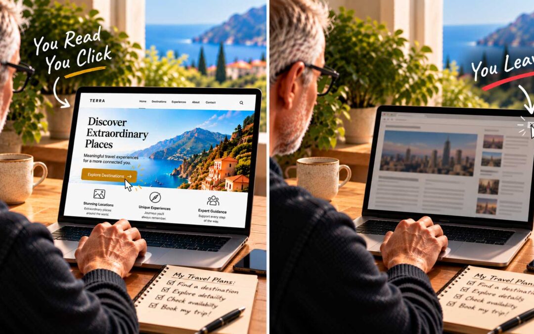
One of the most common problems I see when reviewing websites is text that’s simply too small. Designers love the delicate look of tiny type, but visitors don’t. If people have to squint, they leave.
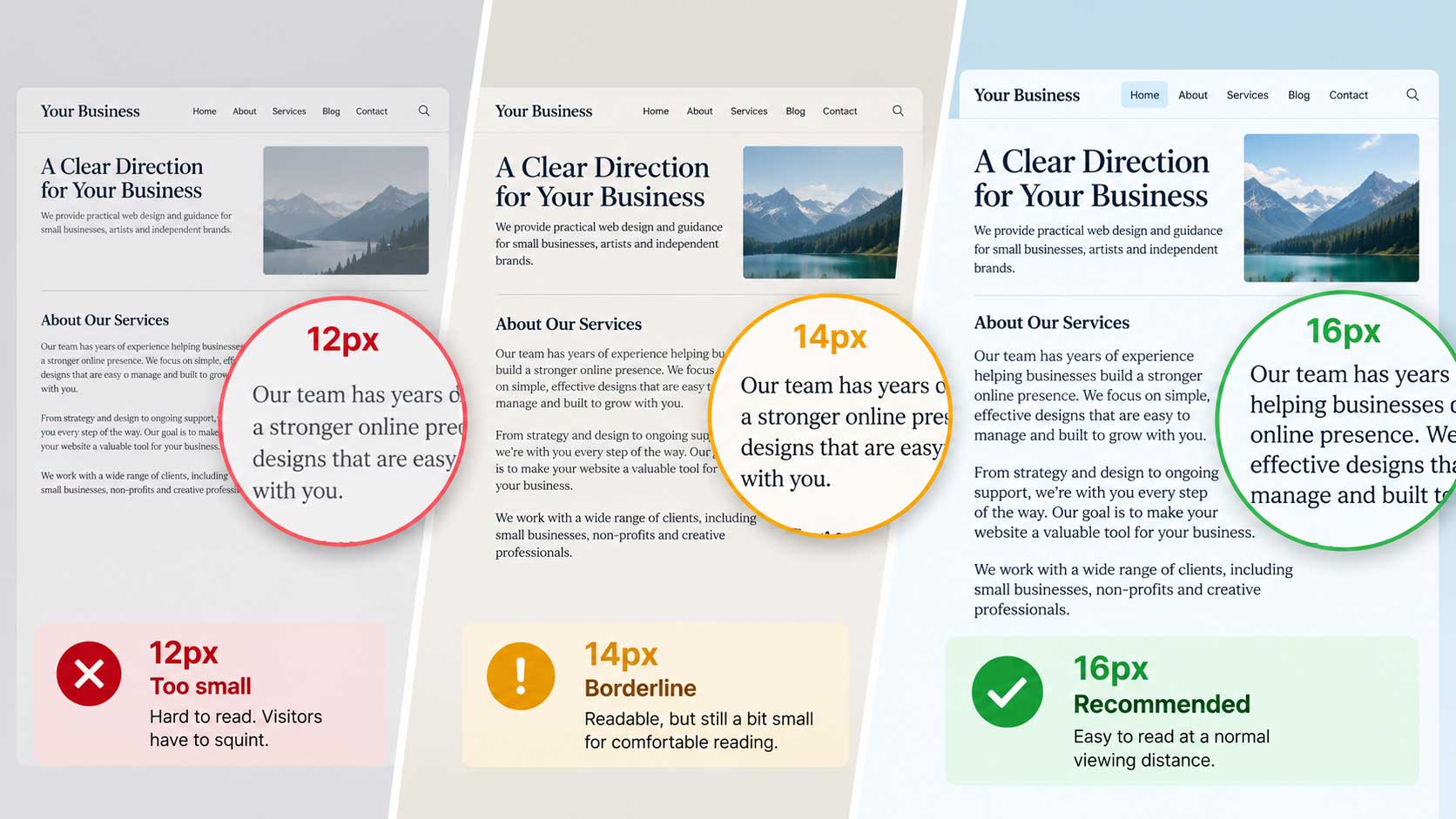
The 16-pixel rule. With few exceptions, most typographers agree that body text on the web should be at least 16 pixels. Twelve-pixel text, which was once common, is far too small for comfortable reading on today’s screens.
Why 16? It comes down to reading distance. Books and magazines are usually set at around 10 points, because we hold them close, often just a short distance from our eyes. A screen sits much farther away, closer to arm’s length. At that distance, you need text closer to 12 points to read comfortably, and 12 points is roughly the same as 16 pixels on most screens. Smashing Magazine made this case well over a decade ago, and it still holds true.
In other words, 16-pixel text on a screen looks about the same size to your eyes as text in a printed book. Anything smaller makes the reader work harder than they should.
Bigger screens, same eyes. Screens have grown larger and sharper over the years, but our eyes haven’t changed. Many modern sites now use 17 or 18 pixels for body text, especially for long articles. Treat 16 pixels as the floor, not the goal.
Think about who’s reading. If your audience is over 40, err on the side of larger text. Eyesight naturally changes with age, and a site that’s comfortable to read earns more trust and more time on the page. We’ll look at this more closely when we cover the ideal sizes of everything online.
Exceptions exist. Smaller text has its place: captions, legal notes, and dense product listings where people are scanning for specific details. Large e-commerce sites sometimes use smaller fonts in product descriptions to fit more onto a page. But your main content, the words you most want people to read, should never be small.
A quick check. Open your site on a phone and on a laptop. Sit back in your chair and try to read a full paragraph. If you find yourself leaning in, your text is too small.