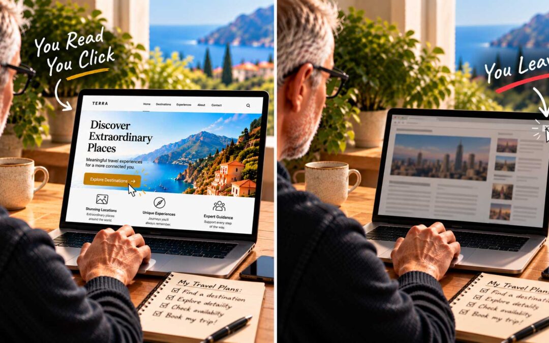
The Trouble with “Pretty Photo” Homepages
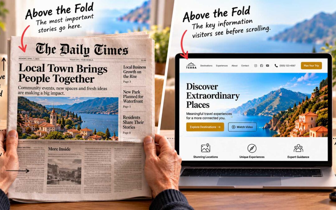
Many website themes today lean toward full-screen, minimal design. You land on a large, beautiful photo with a few words of text and a button, designed to make you click. But how strong does that combination have to be to actually win a click?
It works for famous brands. If your site happens to be Apple, Amazon, or another household name, you can get away with very little explanation. Visitors already know who you are and what you offer. But how does an unknown business get away with it? More often than not, a new visitor won’t click to find out what’s behind door number two if you haven’t told them what’s there.
Your site can match the look of a famous brand in every detail and still fail, because you don’t have their reputation doing the work for you. Give visitors too little information, and you leave them with a pretty photo and not much else to go on.
Back to the basics. Remember the time-tested rule from journalism. You have a few brief seconds to communicate who, what, where, why, and how. Who are you? What do you offer? Where are your services available? Why will your visitor benefit, and how?
But even answering those questions isn’t quite enough. So far, you still haven’t told visitors what’s in it for them. What problem do you solve? What added value do you offer over your competitors?
Your value proposition. That’s where your value proposition comes in. A value proposition is a promise of the value you’ll deliver, and it works only when customers believe you’ll keep it. It’s the reason someone should choose you instead of anyone else, stated simply and clearly.
A strong value proposition is specific. “Quality service you can trust” could describe almost any business. “Same-day boiler repairs across Barcelona, or the call-out is free” tells visitors exactly what they’ll get.
Can one photo do it? A strong value proposition can be delivered with a single photo and a single call to action. It just has to be perfect, and the odds aren’t in your favor.
When full-screen works. Full-width, image-led websites have their place. They can be fantastic for photographers, artists, and high-end designers, whose work speaks for itself. But they aren’t for everybody, and when used in the wrong context, they look out of place, and visitors bounce.