The Ideal Size of Everything Online
So far in this series we’ve talked a lot about layout, eye tracking, and how people read. Now let’s turn to design itself, starting with the size of things.
Web design is all about communication. The designer’s role is to balance text and imagery so the message comes through clearly. It all starts with the content and how best to present it. How big should the text be? How long should a headline be? How much space should there be between the lines?
There are useful guidelines for all of these things.
You don’t need to guess. Writer Kevan Lee collected a fascinating set of benchmarks in a Buffer article about the optimal length of online content. His examples range from headlines and paragraphs to blog posts, emails, videos, and social media. Importantly, Buffer doesn’t present these figures as laws. They’re starting points: use them, test them, and adjust them for your own audience. Buffer
The same principle applies to web typography. Decades of typography and usability research have given designers some very good places to start.
The numbers worth knowing:
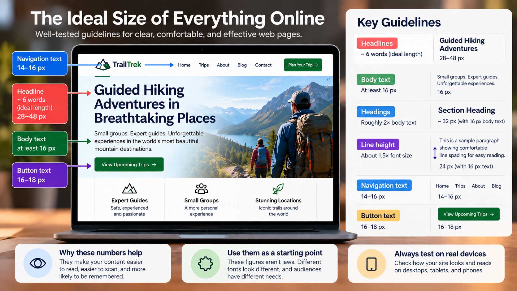
Headlines: around six words. Buffer cites six words as a useful guideline for blog headlines, noting that readers tend to pick up the first three words and the last three. That doesn’t mean every headline needs exactly six words, but it reinforces something we’ve already learned from eye-tracking research: people scan before they read. Buffer
Body text: at least 16 pixels. As we covered earlier in this series, 16 pixels is a sensible minimum for most body copy on a modern website. Many sites go larger—17 or 18 pixels can be particularly comfortable for longer articles. The important thing is that visitors shouldn’t have to lean toward the screen or zoom in to read your main content.
Headings: make the hierarchy obvious. A useful starting point is to make a major heading roughly twice the size of your body text. If your paragraphs are 16 pixels, a heading around 30–32 pixels gives you an obvious visual difference. It isn’t a mathematical rule; different fonts have different proportions. What matters is that someone scanning the page can instantly distinguish the headline, headings, and body copy.
Line height: give the words room to breathe. Body copy generally becomes easier to read when there is generous space between the lines. Around 1.5 times the font size is a good starting point. With 16-pixel text, that gives you a line height of about 24 pixels. Too little spacing makes paragraphs feel dense; too much can make individual lines feel disconnected.
Why these rules help. Once you understand a few basic relationships between font size, hierarchy, and spacing, you stop designing for how a page looks in a mockup and start designing for the person who has to read it.
That’s an important distinction. A paragraph of tiny gray type may look elegant from across the room. It isn’t elegant when someone has to squint to read it.
And once the fundamentals are right, you actually have more freedom to be creative, because you’re no longer fighting readability.
Use them as a starting point. None of these figures should be treated as laws. Buffer makes much the same point about its optimal-length recommendations: start with the available evidence, then test what works for you. Buffer Different typefaces look larger or smaller at the same pixel size. A website aimed at older readers may benefit from larger text. A short promotional page has different needs from a long article.
So start with sensible guidelines, adjust by eye, and always test the finished page on real devices.
There’s one more measurement that makes an enormous difference to readability, and it’s one designers often overlook: how wide should a paragraph be?
Interestingly, the Buffer article has a number for that too. It cites research suggesting an optimal paragraph width of roughly 40 to 55 characters. Buffer
That’s where we’ll go next: how long should a line of text actually be?
Buffer — The Optimal Length for Every Social Media Update and More