No one would stay on a 12,000-word page, no matter how good the product, if it were set in tiny 11-pixel text stretched across a wide screen. On long pages, typography matters more than ever. It’s what keeps your reader engaged all the way to the end.
The typography checklist. Here’s how to structure text for a long page, using the principles from earlier in this series:
- Use body text of at least 16 pixels.
- Make main headings roughly double the body size.
- Keep lines to around 45 to 75 characters, roughly 8 to 12 words.
- Set line height at about 1.5 times the font size.
- Keep the text column to a comfortable width, around 600 to 700 pixels.
- Start a new paragraph every three or four lines.
- Add a new subheading every two or three paragraphs.
- Break up the text with bullet lists, quotes, testimonials, photos, and tables.
Bullet points are one of a designer’s best tools for readability. Breaking content into smaller, digestible pieces makes even complex information feel manageable.
Short sentences help too. They’re easier to read and reduce the effort required to follow a complicated subject. When an idea is complex, breaking it into bite-sized pieces makes it feel simpler.
Make the journey attractive. On a long page, the whole focus of the design is making each chunk of information inviting to read. Separate important information into tables or callout boxes. Add an occasional photo to hold attention. Photos of people work especially well because we’re naturally drawn to faces. Just make sure they’re relevant to what you’re offering.
No exits. Many long sales pages have little or no traditional navigation. That’s deliberate. The page exists for one purpose, so unnecessary distractions are removed. The reader’s choices are essentially to continue, respond to the offer, or leave.
An award-winning example. I once worked with a colleague to redesign a long sales page for a health reference book. The old version was essentially a straight drop of text, with the offer buried far down the page.
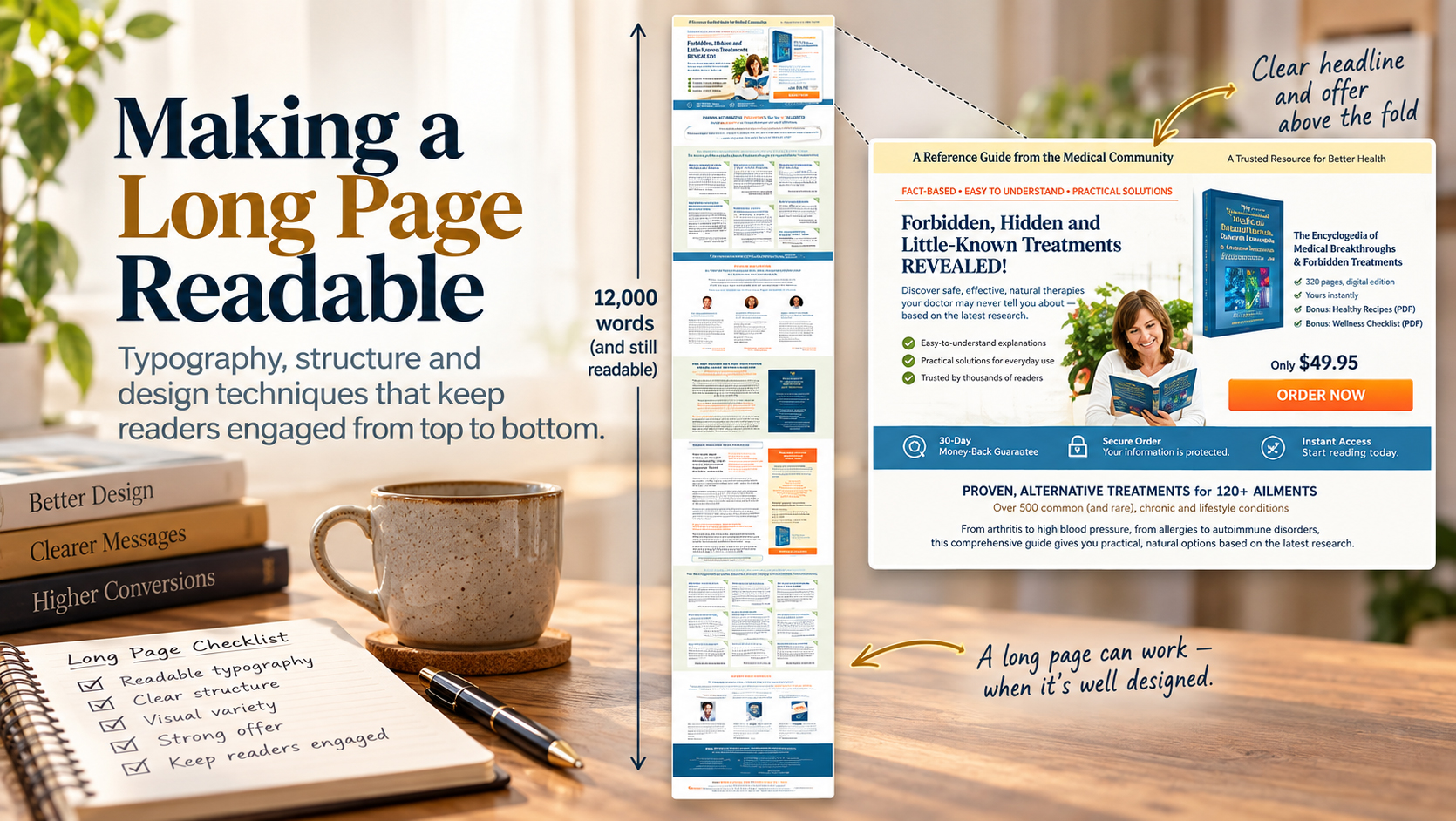
We changed that by putting a strong offer right at the top. The opening section used two uneven columns: the main content introduced the book and its benefits, while the narrower column presented the price, offer details, and a prominent order button. The objective was simple: a visitor shouldn’t have to read thousands of words just to discover what was being sold or how to buy it.

The opening of the redesigned sales page. The product, benefits, price and order path are established immediately, before the long-form content begins.
From there, the page continued for thousands of words, but it didn’t look like one enormous block of copy. Headings created stopping points. Short paragraphs made the text approachable. Bullets, photographs, testimonials, colored panels, tables, and contrasting sections changed the visual rhythm as the reader moved down the page.
The offer also appeared again at appropriate points. Someone who became convinced halfway through didn’t have to scroll all the way back to the top to figure out what to do next.
We must have done something right. The page won a Bronze award for Best Direct Response Web Design from the American Advertising Federation.
To appreciate the design challenge, take a look at the complete page below. You don’t need to read it. Its sheer length is the point.
The complete sales page. At this scale the words aren’t meant to be readable; what matters is the visual rhythm created by headings, images, offers, testimonials, callouts, and changes in layout throughout a very long page.
That’s the real lesson of long-form design. You aren’t designing one enormous page. You’re designing a sequence of small, readable sections that happen to form one long page.