A direct response landing page is designed to get a specific group of people to take a specific action, with the goal of generating a lead or a sale. That action might be calling a phone number, filling out a form, signing up for emails, claiming an offer, starting a chat, requesting a quote, or making a purchase.
Unlike a general homepage, which may serve several audiences and purposes, a direct response page has a much narrower job: turn interest into action.
Marketing does much of the work. A large part of a landing page’s success happens before anyone reaches it. Visitors may arrive through search ads, social media advertising, email campaigns, affiliate partners, direct mail, or even television.
That matters because these visitors aren’t necessarily arriving cold. The advertisement has already introduced an idea, problem, product, or offer. The landing page should continue that conversation rather than starting a new one.
If an ad promises “Fiber internet from €19.90 a month,” for example, the visitor should see that same offer immediately after clicking. Don’t make them wonder whether they’ve arrived at the right place.
One page, one purpose. Like the long-form sales page, a direct response landing page often removes the normal navigation menu. That’s deliberate. If the objective is to request a callback, every unrelated link gives the visitor another place to go.
But there is an important difference between the two approaches.
A long-form sales page may need considerable space to explain an unfamiliar, complicated, or expensive offer. A short direct response page is often aimed at visitors who already understand enough to consider taking the next step.
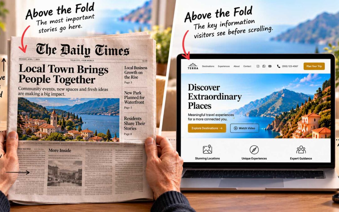
That means the most important information should appear above the fold: what you’re offering, why it matters, what it costs if price is relevant, and what you want the visitor to do next.
The rest of the page can provide supporting information, but the visitor shouldn’t have to scroll just to understand the offer.
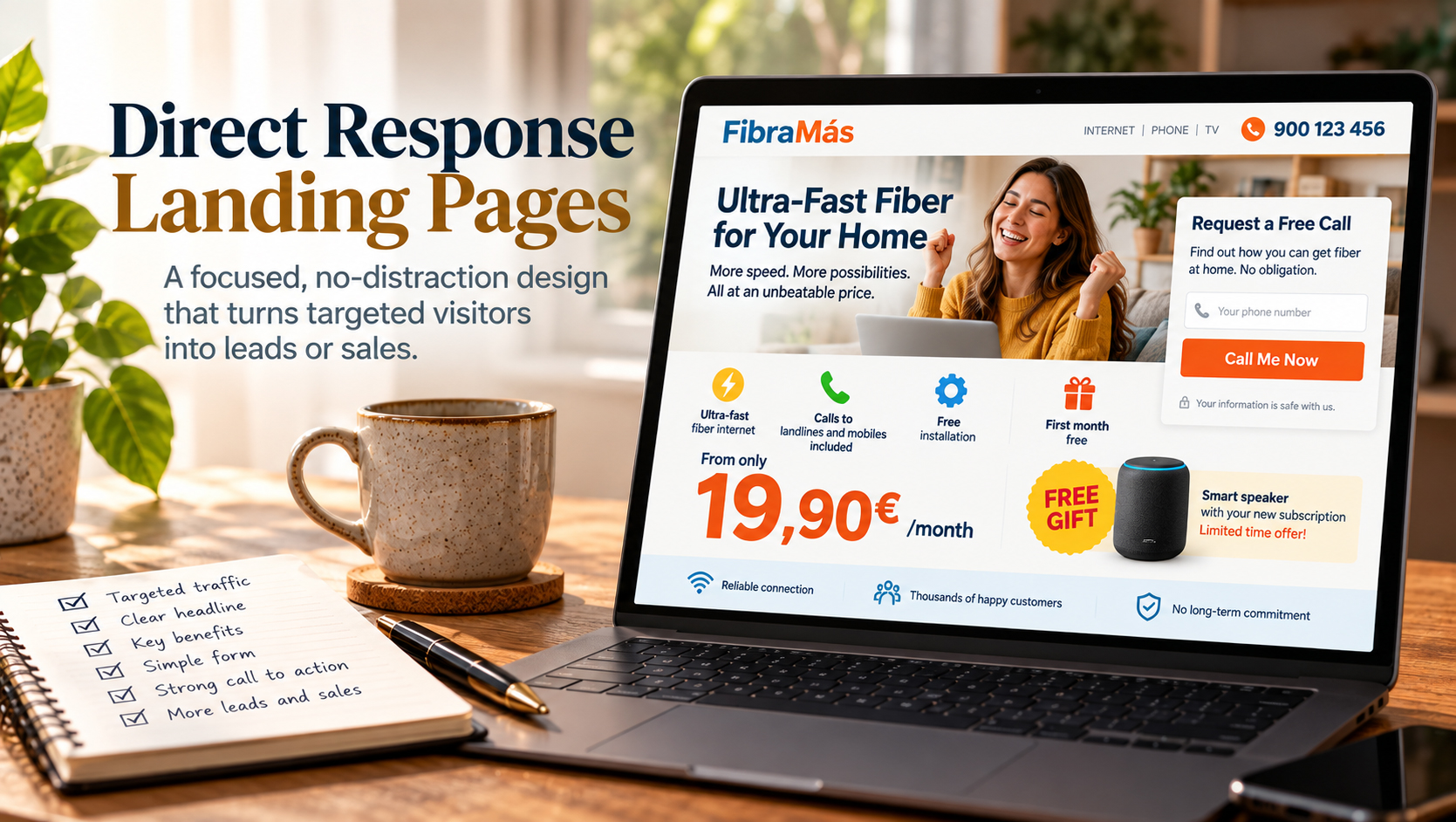
What a strong landing page looks like. A good example I’ve seen came from a Spanish internet provider promoting fiber broadband. The page included:
- An energetic photograph and a bold headline built around the offer.
- A few simple icons summarizing the key benefits: fast fiber, included calls, free installation, and an introductory offer.
- The monthly price in large, impossible-to-miss numbers.
- A short callback form on the right, inviting visitors to enter their phone number for a free, no-obligation call.
- A limited-time bonus highlighted prominently.
Almost everything a prospective customer needed to understand the basic offer was visible at a glance, and responding required only one simple step.
Keep the promise consistent. One of the most important principles in direct response is sometimes called message match. The promise that persuaded someone to click the ad should continue onto the landing page.
If the ad promotes a free consultation, don’t send people to a generic homepage and expect them to hunt for it. If it advertises a particular product at a particular price, that product and offer should be immediately recognizable on the destination page.
That continuity reduces uncertainty and reassures visitors that they’re in the right place.
Design tips for direct response pages:
- Match the headline and offer closely to the advertisement that brought people there.
- Put the primary proposition and call to action above the fold.
- Keep forms as short as practical; ask only for information you genuinely need.
- Make the principal benefit — and the price, when important — unmistakable.
- Give the page one obvious primary call to action.
- Remove unnecessary navigation and competing links.
- Place relevant trust signals near the point of action, such as reviews, guarantees, security information, or a clear privacy statement.
- Make sure the page works just as clearly on a phone as it does on a desktop.
- Test meaningful variations in headlines, offers, forms, and calls to action rather than assuming your first version is the best.
The lesson is simple: a direct response landing page shouldn’t make visitors figure out what to do.
The advertising creates the interest. The page continues the promise, answers the immediate questions, and makes the next step obvious.