Size is only half of good web typography. The typeface you choose shapes how your whole site feels, and how long people are willing to keep reading.
Readability comes first. Some fonts are lovely in a logo but tiring over a full page. Reading an entire website set in Times New Roman, for example, gets wearisome quickly on screen. For body text, choose a typeface designed to be comfortable at small sizes, with open letter shapes and clear spacing.
From safe fonts to web fonts. In the early days, designers were limited to a handful of “web-safe” fonts installed on most computers. Arial, Georgia, and Verdana were used on the vast majority of sites, with Helvetica and Lucida Grande as popular alternatives. Today, services like Google Fonts give you free access to hundreds of well-made typefaces that load on any device. The choice is wider than ever, which makes thoughtful choices even more important.
Keep it simple. Most good websites use no more than two typefaces: one for headings and one for body text. A common approach is to pair a distinctive font for headings with a calm, highly readable one for paragraphs. Using too many fonts makes a site feel cluttered and unprofessional, and every extra font file slows down your page.
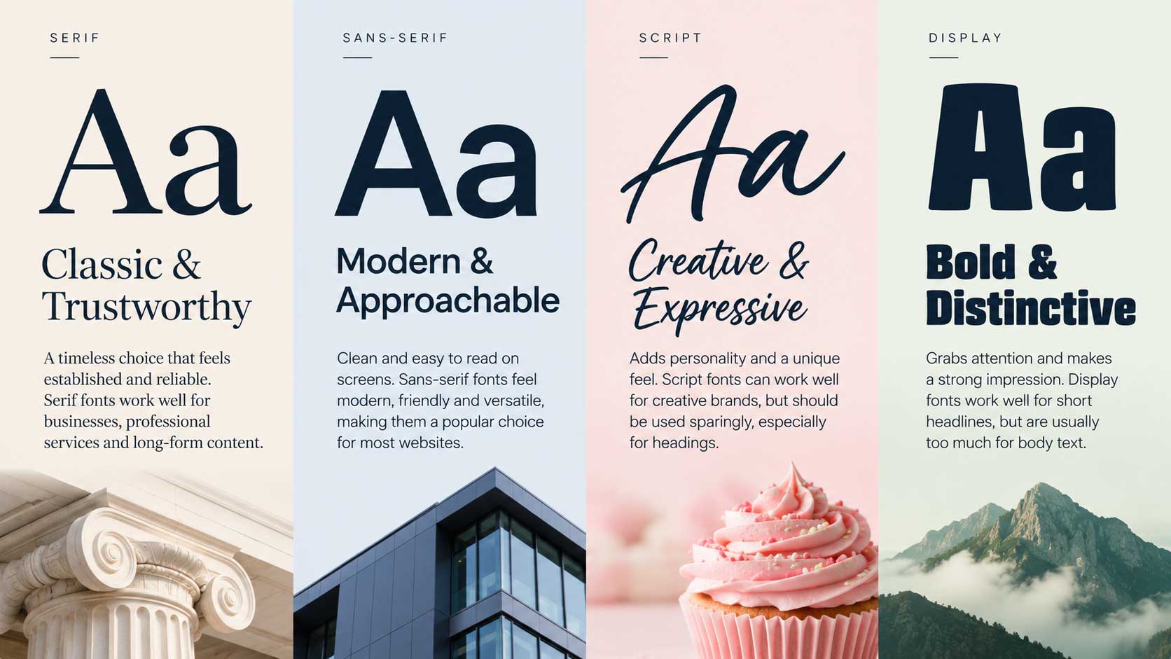
Match the font to the message. Fonts carry personality. A clean sans-serif can feel modern and approachable. A classic serif can feel established and trustworthy. A playful script might suit a bakery but would look out of place on a law firm’s site. Ask what impression you want visitors to form in those first few seconds, and choose accordingly.
Learn from sites you admire. One of the easiest ways to develop an eye for type is to notice fonts on websites you like. Free browser extensions such as WhatFont will tell you the name and size of any font simply by clicking on it, and your browser’s built-in developer tools can show the same information. Collect examples, see what works together, and borrow good combinations.
Test before you commit. Before choosing a font, set a full paragraph of your actual content in it and read it on both a phone and a computer. A typeface that looks elegant in a sample heading can be surprisingly hard to read over several lines.